

Your graphics add a nice touch to my presentations and I recently used them for one of my all-hands meetings. Your toolbox adds professionalism to my slides. Instead of using standard clipart.
Claude Jones, Director of Engineer, @Walmartlabs, USA

Your graphics add a nice touch to my presentations and I recently used them for one of my all-hands meetings. Your toolbox adds professionalism to my slides. Instead of using standard clipart.
Claude Jones, Director of Engineer, @Walmartlabs, USA
I needed a fresh look at some of my slides. I've tried to find a way to create a paintbrush effect, to underline, accentuate, add some color and the handwritten markers were just the things. Very easy to use, easy to size, change the color. It was an affordable, perfect solution and I'm happy to recommend it.
Anonymous, US
The crisp, clean look of the graphics, and the fact that it allowed me to easily edit and change the colors to match the template was my main reason for purchasing them.
Brandie Jenkins, E-learning Developer, USA
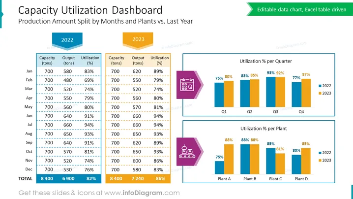
The PowerPoint slide describes a "Capacity Utilization Dashboard" detailing "Production Amount Split by Months and Plants vs. Last Year." It shows data comparison between 2022 and 2023 for capacity, output, and utilization on a monthly and quarterly basis, as well as by different plants. The monthly data are presented in two tables, one for each year, showing a consistent production capacity of 700 tons across all months, varying output in tons, and the resulting utilization percentage. An annual total summarizes the data. Additionally, two bar charts illustrate the utilization percentage per quarter and per plant, comparing 2022 with 2023.
The overall look of the slide is professional, with a clear layout that uses color to differentiate between years and data types. The design is clean and uses visual elements like 3D tags and color-coded charts for easy interpretation and comparison of data.



