

Your graphics add a nice touch to my presentations and I recently used them for one of my all-hands meetings. Your toolbox adds professionalism to my slides. Instead of using standard clipart.
Claude Jones, Director of Engineer, @Walmartlabs, USA

Your graphics add a nice touch to my presentations and I recently used them for one of my all-hands meetings. Your toolbox adds professionalism to my slides. Instead of using standard clipart.
Claude Jones, Director of Engineer, @Walmartlabs, USA
I needed a fresh look at some of my slides. I've tried to find a way to create a paintbrush effect, to underline, accentuate, add some color and the handwritten markers were just the things. Very easy to use, easy to size, change the color. It was an affordable, perfect solution and I'm happy to recommend it.
Anonymous, US
The crisp, clean look of the graphics, and the fact that it allowed me to easily edit and change the colors to match the template was my main reason for purchasing them.
Brandie Jenkins, E-learning Developer, USA
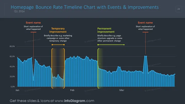
This slide presents the "Homepage Bounce Rate Timeline Chart with Events & Improvements" for Q1 20XX, illustrating a data timeline with embedded events and their effects on bounce rate. The timeline showcases two significant interventions: one temporary improvement, such as a marketing campaign, marked by an orange outline, and one permanent improvement, such as a page structure upgrade, marked by a green outline, which are accompanied by brief descriptions and event names. Additionally, it poses a hypothetical scenario for other events affecting the bounce rate that lack explicit details on the slide.
The slide features a modern, sleek design dominated by blue hues accented with contrasting colors for emphasis. Despite its simplicity, it effectively communicates complex data through clear visualization and highlighted annotations.



