

Your graphics add a nice touch to my presentations and I recently used them for one of my all-hands meetings. Your toolbox adds professionalism to my slides. Instead of using standard clipart.
Claude Jones, Director of Engineer, @Walmartlabs, USA

Your graphics add a nice touch to my presentations and I recently used them for one of my all-hands meetings. Your toolbox adds professionalism to my slides. Instead of using standard clipart.
Claude Jones, Director of Engineer, @Walmartlabs, USA
I needed a fresh look at some of my slides. I've tried to find a way to create a paintbrush effect, to underline, accentuate, add some color and the handwritten markers were just the things. Very easy to use, easy to size, change the color. It was an affordable, perfect solution and I'm happy to recommend it.
Anonymous, US
The crisp, clean look of the graphics, and the fact that it allowed me to easily edit and change the colors to match the template was my main reason for purchasing them.
Brandie Jenkins, E-learning Developer, USA
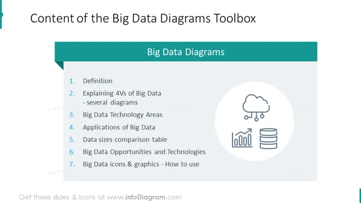
The slide is titled "Big Data Diagrams" and outlines the contents of a toolbox designed for presenting big data concepts. The topics covered include: 1) Definition – presumably the basic concepts of big data, 2) Explaining 4Vs of Big Data – covering the four key characteristics: volume, velocity, variety, and veracity, 3) Big Data Technology Areas – likely an overview of technical domains within big data, 4) Applications of Big Data – examples where big data can be utilized, 5) Data sizes comparison table – a visual comparison of different data sizes, 6) Big Data Opportunities and Technologies – potential opportunities and relevant technologies in the field, 7) Big Data icons & graphics - How to use – guidance on utilizing icons and graphics for big data presentations.
The overall look of the slide is clean and professional, with a color scheme dominated by shades of teal and blue. The use of a gradient in the list items adds visual interest and makes the slide aesthetically pleasing.



