
Your graphics add a nice touch to my presentations and I recently used them for one of my all-hands meetings. Your toolbox adds professionalism to my slides. Instead of using standard clipart.
Claude Jones, Director of Engineer, @Walmartlabs, USA

Your graphics add a nice touch to my presentations and I recently used them for one of my all-hands meetings. Your toolbox adds professionalism to my slides. Instead of using standard clipart.
Claude Jones, Director of Engineer, @Walmartlabs, USA

I needed a fresh look at some of my slides. I've tried to find a way to create a paintbrush effect, to underline, accentuate, add some color and the handwritten markers were just the things. Very easy to use, easy to size, change the color. It was an affordable, perfect solution and I'm happy to recommend it.
Anonymous, US
The crisp, clean look of the graphics, and the fact that it allowed me to easily edit and change the colors to match the template was my main reason for purchasing them.
Brandie Jenkins, E-learning Developer, USA
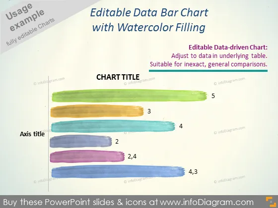
The PowerPoint slide is showcasing an "Editable Data Bar Chart with Watercolor Filling," emphasizing its suitability for general, inexact comparisons. It draws attention to the feature that the chart is data-driven and can be adjusted based on the data in the underlying table. Each bar on the chart represents a value, with numbers like 2, 3, and 5 suggesting different data points, which likely correlate to different categories or periods.
The slide has an artistic feel due to the watercolor-effect bars, giving the chart an approachable, non-traditional look. The text and placeholders are minimal, ensuring the focus remains on the stylized data representation.


