

Your graphics add a nice touch to my presentations and I recently used them for one of my all-hands meetings. Your toolbox adds professionalism to my slides. Instead of using standard clipart.
Claude Jones, Director of Engineer, @Walmartlabs, USA

Your graphics add a nice touch to my presentations and I recently used them for one of my all-hands meetings. Your toolbox adds professionalism to my slides. Instead of using standard clipart.
Claude Jones, Director of Engineer, @Walmartlabs, USA
I needed a fresh look at some of my slides. I've tried to find a way to create a paintbrush effect, to underline, accentuate, add some color and the handwritten markers were just the things. Very easy to use, easy to size, change the color. It was an affordable, perfect solution and I'm happy to recommend it.
Anonymous, US
The crisp, clean look of the graphics, and the fact that it allowed me to easily edit and change the colors to match the template was my main reason for purchasing them.
Brandie Jenkins, E-learning Developer, USA
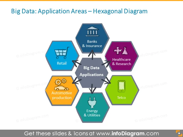
The slide presents the diverse sectors where Big Data can be applied, visually represented through a central hexagon labeled "Big Data Applications," surrounded by six other hexagons. Each surrounding hexagon represents a different industry: "Banks & Insurance," implying financial services; "Healthcare & Research," relating to medical and scientific data usage; "Telco," denoting telecommunications; "Energy & Utilities," indicating sectors like electricity and water; "Automotive production," which covers vehicle manufacturing data; and "Retail," referring to consumer sales analytics.
The slide has a clean, organized appearance with a harmonious color palette and easy-to-understand visual connectors that create a hub-and-spoke model. The icons are intuitive, aiding quick recognition of the corresponding sectors.



