

Your graphics add a nice touch to my presentations and I recently used them for one of my all-hands meetings. Your toolbox adds professionalism to my slides. Instead of using standard clipart.
Claude Jones, Director of Engineer, @Walmartlabs, USA

Your graphics add a nice touch to my presentations and I recently used them for one of my all-hands meetings. Your toolbox adds professionalism to my slides. Instead of using standard clipart.
Claude Jones, Director of Engineer, @Walmartlabs, USA
I needed a fresh look at some of my slides. I've tried to find a way to create a paintbrush effect, to underline, accentuate, add some color and the handwritten markers were just the things. Very easy to use, easy to size, change the color. It was an affordable, perfect solution and I'm happy to recommend it.
Anonymous, US
The crisp, clean look of the graphics, and the fact that it allowed me to easily edit and change the colors to match the template was my main reason for purchasing them.
Brandie Jenkins, E-learning Developer, USA
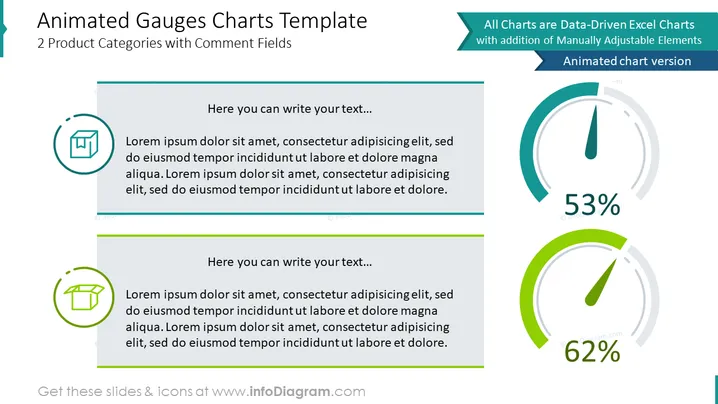
The PowerPoint slide titled "Animated Gauges Charts Template" presents a visually engaging method to display data through two product categories with comment fields. It illustrates the concept of data-driven charts, highlighting that the charts are generated from Excel data and have elements which can be manually adjusted. Additionally, there's a mention of an animated chart version, suggesting that these visual representations can be dynamic. The template is designed for users to input their text and data, offering placeholders for explanatory text alongside the gauges, thus facilitating customization to reflect specific metrics or indicators.
The PowerPoint slide has a sleek and professional look with a well-structured layout that visually separates content into clear segments. The use of gauges adds a graphical element to represent data in an easily interpretable and engaging way.



