

Your graphics add a nice touch to my presentations and I recently used them for one of my all-hands meetings. Your toolbox adds professionalism to my slides. Instead of using standard clipart.
Claude Jones, Director of Engineer, @Walmartlabs, USA

Your graphics add a nice touch to my presentations and I recently used them for one of my all-hands meetings. Your toolbox adds professionalism to my slides. Instead of using standard clipart.
Claude Jones, Director of Engineer, @Walmartlabs, USA
I needed a fresh look at some of my slides. I've tried to find a way to create a paintbrush effect, to underline, accentuate, add some color and the handwritten markers were just the things. Very easy to use, easy to size, change the color. It was an affordable, perfect solution and I'm happy to recommend it.
Anonymous, US
The crisp, clean look of the graphics, and the fact that it allowed me to easily edit and change the colors to match the template was my main reason for purchasing them.
Brandie Jenkins, E-learning Developer, USA
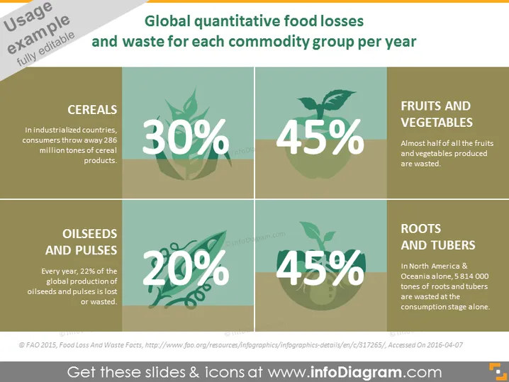
This PowerPoint slide illustrates the percentage of food waste for different commodity groups per year, presenting a compelling visual of food waste statistics in an informative manner. It reveals that 30% of cereals are wasted, with industrialized countries discarding 286 million tons of cereal products. Fruits and Vegetables account for the highest waste at 45%, noting that almost half of all produced are wasted. Oilseeds and Pulses see 20% of global production lost, while Roots and Tubers also face a significant waste percentage of 45%, with North America and Oceania contributing 5,814,000 tons of waste on consumption alone.
The overall look of the slide is clean and professional, with a strong focus on readability and information hierarchy. The visually distinct panels make it easy to identify and compare statistics at a glance.



