Your graphics add a nice touch to my presentations and I recently used them for one of my all-hands meetings. Your toolbox adds professionalism to my slides. Instead of using standard clipart.
Claude Jones, Director of Engineer, @Walmartlabs, USA
Your graphics add a nice touch to my presentations and I recently used them for one of my all-hands meetings. Your toolbox adds professionalism to my slides. Instead of using standard clipart.
Claude Jones, Director of Engineer, @Walmartlabs, USA
I needed a fresh look at some of my slides. I've tried to find a way to create a paintbrush effect, to underline, accentuate, add some color and the handwritten markers were just the things. Very easy to use, easy to size, change the color. It was an affordable, perfect solution and I'm happy to recommend it.
Anonymous, US
The crisp, clean look of the graphics, and the fact that it allowed me to easily edit and change the colors to match the template was my main reason for purchasing them.
Brandie Jenkins, E-learning Developer, USA
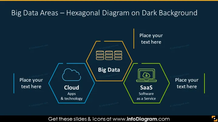
Cette diapositive fournit une représentation graphique des domaines du Big Data à l'aide d'un diagramme hexagonal. Elle présente trois composants clés : Cloud (mettant en avant les applications et la technologie), Big Data et SaaS (Software as a Service), chacun dans son propre hexagone. Le placement suggère une relation connectée entre les trois domaines, intégrale à l'infrastructure des technologies Big Data. Les espaces réservés pour le texte suggèrent que le modèle est conçu pour être personnalisé afin de s'adapter au contenu spécifique du présentateur.
Le fond sombre de la diapositive contraste fortement avec les contours et icônes vibrants, attirant l'attention sur les hexagones interconnectés et leurs domaines respectifs des technologies Big Data. Le design est élégant et moderne, avec un accent clair sur le diagramme au centre.


