Your graphics add a nice touch to my presentations and I recently used them for one of my all-hands meetings. Your toolbox adds professionalism to my slides. Instead of using standard clipart.
Claude Jones, Director of Engineer, @Walmartlabs, USA
Your graphics add a nice touch to my presentations and I recently used them for one of my all-hands meetings. Your toolbox adds professionalism to my slides. Instead of using standard clipart.
Claude Jones, Director of Engineer, @Walmartlabs, USA
I needed a fresh look at some of my slides. I've tried to find a way to create a paintbrush effect, to underline, accentuate, add some color and the handwritten markers were just the things. Very easy to use, easy to size, change the color. It was an affordable, perfect solution and I'm happy to recommend it.
Anonymous, US
The crisp, clean look of the graphics, and the fact that it allowed me to easily edit and change the colors to match the template was my main reason for purchasing them.
Brandie Jenkins, E-learning Developer, USA
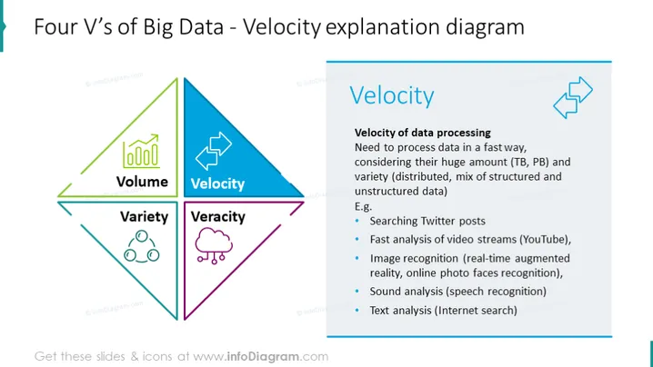
La diapositive aborde l'aspect 'Vélocité' des Quatre V de Big Data, soulignant la nécessité d'un traitement rapide des données face à d'énormes volumes (Téraoctets, Pétaoctets) et une grande diversité (données structurées et non structurées). Elle liste des exemples de Vélocité en action : recherche de publications sur Twitter, analyse rapide de flux vidéo comme YouTube, reconnaissance d'images pour la réalité augmentée et reconnaissance faciale, analyse sonore pour la reconnaissance vocale, et analyse de texte pour les recherches Internet.
La diapositive présente un design moderne et épuré, utilisant une forme de diamant codée par couleur pour mettre l'accent sur le composant 'Vélocité' de Big Data. L'utilisation d'icônes et de couleurs contrastées rend l'information facilement digestible et visuellement engageante.


