

Your graphics add a nice touch to my presentations and I recently used them for one of my all-hands meetings. Your toolbox adds professionalism to my slides. Instead of using standard clipart.
Claude Jones, Director of Engineer, @Walmartlabs, USA

Your graphics add a nice touch to my presentations and I recently used them for one of my all-hands meetings. Your toolbox adds professionalism to my slides. Instead of using standard clipart.
Claude Jones, Director of Engineer, @Walmartlabs, USA
I needed a fresh look at some of my slides. I've tried to find a way to create a paintbrush effect, to underline, accentuate, add some color and the handwritten markers were just the things. Very easy to use, easy to size, change the color. It was an affordable, perfect solution and I'm happy to recommend it.
Anonymous, US
The crisp, clean look of the graphics, and the fact that it allowed me to easily edit and change the colors to match the template was my main reason for purchasing them.
Brandie Jenkins, E-learning Developer, USA
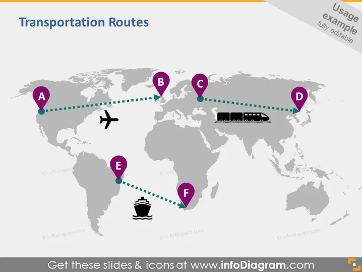
La diapositive présente un aperçu conceptuel des différents itinéraires de transport sur une carte du monde, marqués de A à F. Ces points sont reliés par des lignes en pointillés suggérant des itinéraires ou des chemins de voyage entre eux. Des icônes telles qu'un avion, un train et un navire indiquent différents modes de transport le long de ces itinéraires. Chaque point représente probablement un lieu clé, comme un hub de transport ou un jalon au sein d'un réseau logistique, les icônes impliquant le flux de cargaisons ou de passagers.



