Your graphics add a nice touch to my presentations and I recently used them for one of my all-hands meetings. Your toolbox adds professionalism to my slides. Instead of using standard clipart.
Claude Jones, Director of Engineer, @Walmartlabs, USA
Your graphics add a nice touch to my presentations and I recently used them for one of my all-hands meetings. Your toolbox adds professionalism to my slides. Instead of using standard clipart.
Claude Jones, Director of Engineer, @Walmartlabs, USA
I needed a fresh look at some of my slides. I've tried to find a way to create a paintbrush effect, to underline, accentuate, add some color and the handwritten markers were just the things. Very easy to use, easy to size, change the color. It was an affordable, perfect solution and I'm happy to recommend it.
Anonymous, US
The crisp, clean look of the graphics, and the fact that it allowed me to easily edit and change the colors to match the template was my main reason for purchasing them.
Brandie Jenkins, E-learning Developer, USA
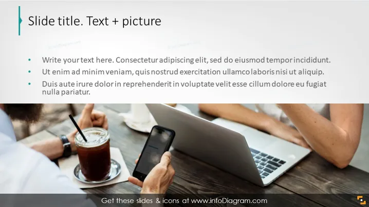
La diapositive est intitulée "Titre de la diapositive. Texte + image," indiquant une structure qui combine contenu écrit et éléments visuels. Trois points principaux suggèrent des domaines pour saisir du texte correspondant, chaque invitation laissant entendre une familiarité avec le langage commercial et encourageant la concision. Ces prompts pourraient être des espaces réservés pour des points clés dans une présentation, tels qu'un résumé de projet, mettant en évidence les avantages ou discutant des défis, qui sont typiques dans les présentations commerciales ou marketing.
L'apparence générale de la diapositive est professionnelle, avec une claire division entre le contenu textuel à gauche et une image contextuelle à droite. Le schéma de couleurs est neutre, et la diapositive utilise un design minimaliste qui met l'accent sur le contenu plutôt que sur des graphiques ou des décorations lourdes.


