Your graphics add a nice touch to my presentations and I recently used them for one of my all-hands meetings. Your toolbox adds professionalism to my slides. Instead of using standard clipart.
Claude Jones, Director of Engineer, @Walmartlabs, USA
Your graphics add a nice touch to my presentations and I recently used them for one of my all-hands meetings. Your toolbox adds professionalism to my slides. Instead of using standard clipart.
Claude Jones, Director of Engineer, @Walmartlabs, USA
I needed a fresh look at some of my slides. I've tried to find a way to create a paintbrush effect, to underline, accentuate, add some color and the handwritten markers were just the things. Very easy to use, easy to size, change the color. It was an affordable, perfect solution and I'm happy to recommend it.
Anonymous, US
The crisp, clean look of the graphics, and the fact that it allowed me to easily edit and change the colors to match the template was my main reason for purchasing them.
Brandie Jenkins, E-learning Developer, USA
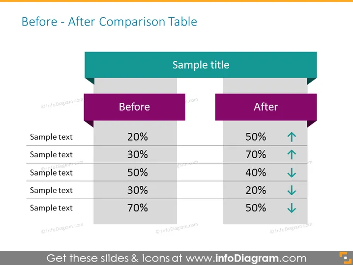
La diapositive présente un "Tableau de comparaison Avant - Après" qui comporte deux colonnes étiquetées "Avant" et "Après", chacune consistant en cinq paires d'éléments avec des pourcentages correspondants. Ces paires indiquent un indicateur comparatif, la colonne "Avant" montrant l'état initial et la colonne "Après" montrant l'état modifié. Chaque élément "Après" inclut également une flèche, signifiant si le nombre a augmenté (flèche vers le haut) ou a diminué (flèche vers le bas). Cette comparaison visuelle indique les améliorations ou les déclins de performance entre deux états différents.


