Your graphics add a nice touch to my presentations and I recently used them for one of my all-hands meetings. Your toolbox adds professionalism to my slides. Instead of using standard clipart.
Claude Jones, Director of Engineer, @Walmartlabs, USA
Your graphics add a nice touch to my presentations and I recently used them for one of my all-hands meetings. Your toolbox adds professionalism to my slides. Instead of using standard clipart.
Claude Jones, Director of Engineer, @Walmartlabs, USA
I needed a fresh look at some of my slides. I've tried to find a way to create a paintbrush effect, to underline, accentuate, add some color and the handwritten markers were just the things. Very easy to use, easy to size, change the color. It was an affordable, perfect solution and I'm happy to recommend it.
Anonymous, US
The crisp, clean look of the graphics, and the fact that it allowed me to easily edit and change the colors to match the template was my main reason for purchasing them.
Brandie Jenkins, E-learning Developer, USA
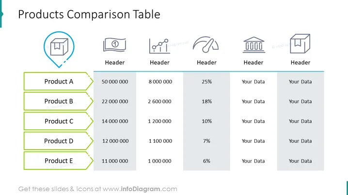
La diapositive présente un "Tableau de Comparaison des Produits" avec cinq produits, de A à E. Ce tableau compare plusieurs points de données à travers les produits : des valeurs numériques pouvant représenter des ventes, des quantités, ou d'autres métriques, et deux colonnes intitulées "Vos Données," suggérant des champs personnalisables. Chaque ligne de produit implique une hiérarchie, peut-être basée sur l'une des colonnes numériques, comme le revenu ou les unités vendues. C'est un outil de comparaison côte à côte de la performance ou des caractéristiques des produits.


