Your graphics add a nice touch to my presentations and I recently used them for one of my all-hands meetings. Your toolbox adds professionalism to my slides. Instead of using standard clipart.
Claude Jones, Director of Engineer, @Walmartlabs, USA
Your graphics add a nice touch to my presentations and I recently used them for one of my all-hands meetings. Your toolbox adds professionalism to my slides. Instead of using standard clipart.
Claude Jones, Director of Engineer, @Walmartlabs, USA
I needed a fresh look at some of my slides. I've tried to find a way to create a paintbrush effect, to underline, accentuate, add some color and the handwritten markers were just the things. Very easy to use, easy to size, change the color. It was an affordable, perfect solution and I'm happy to recommend it.
Anonymous, US
The crisp, clean look of the graphics, and the fact that it allowed me to easily edit and change the colors to match the template was my main reason for purchasing them.
Brandie Jenkins, E-learning Developer, USA
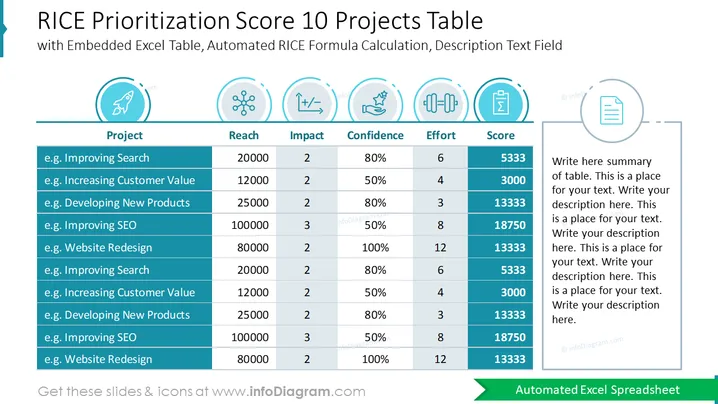
La diapositive est un tableau de Score de Priorisation RICE pour 10 projets différents, mettant en œuvre un cadre stratégique qui quantifie la priorité des projets. Ce modèle prend en compte quatre facteurs : Portée, Impact, Confiance et Effort. Chaque projet répertorié a des données hypothétiques sous ces catégories, le 'Score' final reflétant un calcul automatisé suivant la formule RICE. Plus le score est élevé, plus la priorité est grande. L'espace réservé à droite est prévu pour un résumé du tableau ou un texte descriptif supplémentaire concernant la méthodologie ou les résultats.
La composition visuelle globale est propre et professionnelle, avec un schéma de couleurs bleu et teal promouvant un sentiment de clarté et d'organisation. L'utilisation d'icônes et de surbrillances de couleur aide à différencier les différents éléments du système de notation RICE.


