Your graphics add a nice touch to my presentations and I recently used them for one of my all-hands meetings. Your toolbox adds professionalism to my slides. Instead of using standard clipart.
Claude Jones, Director of Engineer, @Walmartlabs, USA
Your graphics add a nice touch to my presentations and I recently used them for one of my all-hands meetings. Your toolbox adds professionalism to my slides. Instead of using standard clipart.
Claude Jones, Director of Engineer, @Walmartlabs, USA
I needed a fresh look at some of my slides. I've tried to find a way to create a paintbrush effect, to underline, accentuate, add some color and the handwritten markers were just the things. Very easy to use, easy to size, change the color. It was an affordable, perfect solution and I'm happy to recommend it.
Anonymous, US
The crisp, clean look of the graphics, and the fact that it allowed me to easily edit and change the colors to match the template was my main reason for purchasing them.
Brandie Jenkins, E-learning Developer, USA
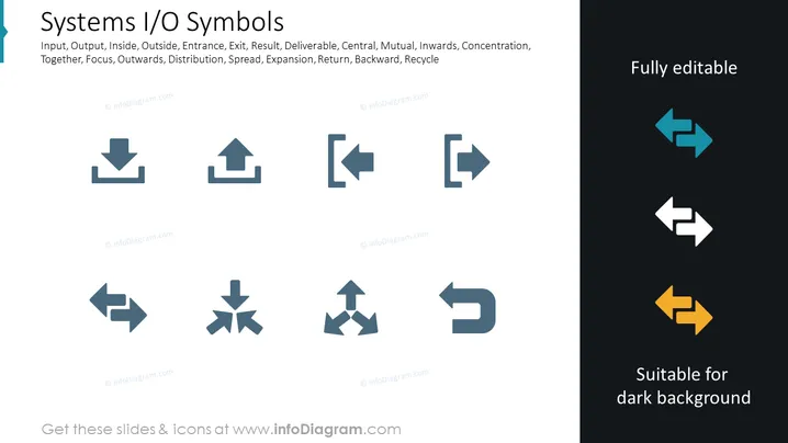
La diapositive intitulée "Symboles I/O des Systèmes" présente une variété d'icônes couramment utilisées pour représenter différentes entrées et sorties systèmes ou d'autres concepts liés aux processus. Chaque icône transmet visuellement des concepts tels que Entrée, Sortie, qui signifient généralement des données entrant ou sortant d'un système ; Intérieur, Extérieur, indiquant l'inclusion à l'intérieur ou à l'extérieur d'un système ; Entrée, Sortie, représentant les points d'entrée ou de sortie ; Résultat, Livrable, soulignant les résultats ou les produits ; Central, Mutuel, désignant les aspects principaux ou coopératifs ; Vers l'intérieur, Concentration, suggérant un mouvement vers le centre ou le focus ; Vers l'extérieur, Distribution, impliquant une diffusion ; Répartition, Expansion, mettant en avant l'augmentation ou la croissance ; Retour, Arrière, signalant un renversement ou un retour en arrière ; et Recyclage, promouvant l'idée de réutilisation ou de réaffectation.
La diapositive a une apparence nette et professionnelle avec un accent clair sur les icônes. L'utilisation des couleurs est minimale, mettant en avant la simplicité et la clarté du design.


