Your graphics add a nice touch to my presentations and I recently used them for one of my all-hands meetings. Your toolbox adds professionalism to my slides. Instead of using standard clipart.
Claude Jones, Director of Engineer, @Walmartlabs, USA
Your graphics add a nice touch to my presentations and I recently used them for one of my all-hands meetings. Your toolbox adds professionalism to my slides. Instead of using standard clipart.
Claude Jones, Director of Engineer, @Walmartlabs, USA
I needed a fresh look at some of my slides. I've tried to find a way to create a paintbrush effect, to underline, accentuate, add some color and the handwritten markers were just the things. Very easy to use, easy to size, change the color. It was an affordable, perfect solution and I'm happy to recommend it.
Anonymous, US
The crisp, clean look of the graphics, and the fact that it allowed me to easily edit and change the colors to match the template was my main reason for purchasing them.
Brandie Jenkins, E-learning Developer, USA
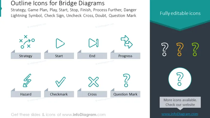
La diapositive présente une collection d'"Icônes Contour pour Diagrammes de Pont", qui servent probablement de métaphores visuelles pour enrichir le sens des processus ou des étapes dans un organigramme. Ces icônes représentent divers concepts : "Stratégie" est illustrée par un jeu de football, indiquant la planification ou les tactiques ; "Démarrer" est un bouton de lecture symbolisant l'initiation ou le commencement ; "Fin" est un drapeau, dénotant l'achèvement ou un objectif ; et "Progrès" avec des flèches revenant en arrière, suggérant un mouvement ou un développement continu. D'autres icônes incluent "Danger" avec un éclair représentant le danger ou le risque, "Coche" montrant une approbation ou un achèvement, "Croix" pour incorrect ou négatif, et "Point d'interrogation" pour le doute ou l'enquête.
L'apparence générale de la diapositive est élégante et moderne, avec un schéma de couleurs professionnel et un design d'icônes uniforme. Les icônes sont simplistes mais descriptives, et la grande police est facile à lire et s'aligne visuellement bien avec le design des icônes.


