

Your graphics add a nice touch to my presentations and I recently used them for one of my all-hands meetings. Your toolbox adds professionalism to my slides. Instead of using standard clipart.
Claude Jones, Director of Engineer, @Walmartlabs, USA

Your graphics add a nice touch to my presentations and I recently used them for one of my all-hands meetings. Your toolbox adds professionalism to my slides. Instead of using standard clipart.
Claude Jones, Director of Engineer, @Walmartlabs, USA
I needed a fresh look at some of my slides. I've tried to find a way to create a paintbrush effect, to underline, accentuate, add some color and the handwritten markers were just the things. Very easy to use, easy to size, change the color. It was an affordable, perfect solution and I'm happy to recommend it.
Anonymous, US
The crisp, clean look of the graphics, and the fact that it allowed me to easily edit and change the colors to match the template was my main reason for purchasing them.
Brandie Jenkins, E-learning Developer, USA
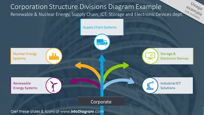
La diapositive PowerPoint intitulée "Exemple de Diagramme de Structure de la Société" illustre la structure organisationnelle d'une société qui englobe divers départements spécialisés : Énergie Renouvelable & Nucléaire, Chaîne d'Approvisionnement, TIC, Stockage et Dispositifs Électroniques.
Le diagramme affiche une boîte centrale étiquetée "Corporate", avec des flèches colorées s'étendant vers des listes de départements individuels montrant leurs rôles respectifs. Chaque département est représenté par une icône et un label, désignant son domaine d'expertise au sein de la structure de l'entreprise.
La composition visuelle de la diapositive est professionnelle, utilisant une approche de diagramme centralisé pour communiquer efficacement l'interrelation entre les entités corporatives et divisionnaires. L'utilisation de couleurs distinctes et d'icônes simplistes facilite la compréhension rapide et aide à maintenir une présentation claire et organisée.



