
Your graphics add a nice touch to my presentations and I recently used them for one of my all-hands meetings. Your toolbox adds professionalism to my slides. Instead of using standard clipart.
Claude Jones, Director of Engineer, @Walmartlabs, USA

Your graphics add a nice touch to my presentations and I recently used them for one of my all-hands meetings. Your toolbox adds professionalism to my slides. Instead of using standard clipart.
Claude Jones, Director of Engineer, @Walmartlabs, USA

I needed a fresh look at some of my slides. I've tried to find a way to create a paintbrush effect, to underline, accentuate, add some color and the handwritten markers were just the things. Very easy to use, easy to size, change the color. It was an affordable, perfect solution and I'm happy to recommend it.
Anonymous, US
The crisp, clean look of the graphics, and the fact that it allowed me to easily edit and change the colors to match the template was my main reason for purchasing them.
Brandie Jenkins, E-learning Developer, USA
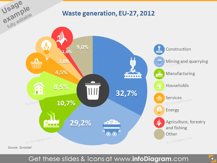
Cette diapositive présente des données sur la génération de déchets au sein de l'UE-27 en 2012. Elle utilise un diagramme circulaire pour illustrer la proportion de déchets générés par divers secteurs. Les ménages sont responsables de la plus grande part avec 32,7 %, suivis par l'Industrie (29,2 %) et les Services (10,7 %). D'autres secteurs inclus, tels que la Construction (9,0 %), l'Énergie (4,5 %) et l'Agriculture, la foresterie et la pêche (1,6 %), contribuent respectivement à des pourcentages plus petits, indiquant leur impact relatif sur la génération de déchets.
La diapositive a un look propre et moderne avec un schéma de couleurs vives. L'utilisation d'icônes aux côtés des segments du diagramme circulaire rend la présentation des données intuitive et visuellement engageante.


