

Your graphics add a nice touch to my presentations and I recently used them for one of my all-hands meetings. Your toolbox adds professionalism to my slides. Instead of using standard clipart.
Claude Jones, Director of Engineer, @Walmartlabs, USA

Your graphics add a nice touch to my presentations and I recently used them for one of my all-hands meetings. Your toolbox adds professionalism to my slides. Instead of using standard clipart.
Claude Jones, Director of Engineer, @Walmartlabs, USA
I needed a fresh look at some of my slides. I've tried to find a way to create a paintbrush effect, to underline, accentuate, add some color and the handwritten markers were just the things. Very easy to use, easy to size, change the color. It was an affordable, perfect solution and I'm happy to recommend it.
Anonymous, US
The crisp, clean look of the graphics, and the fact that it allowed me to easily edit and change the colors to match the template was my main reason for purchasing them.
Brandie Jenkins, E-learning Developer, USA
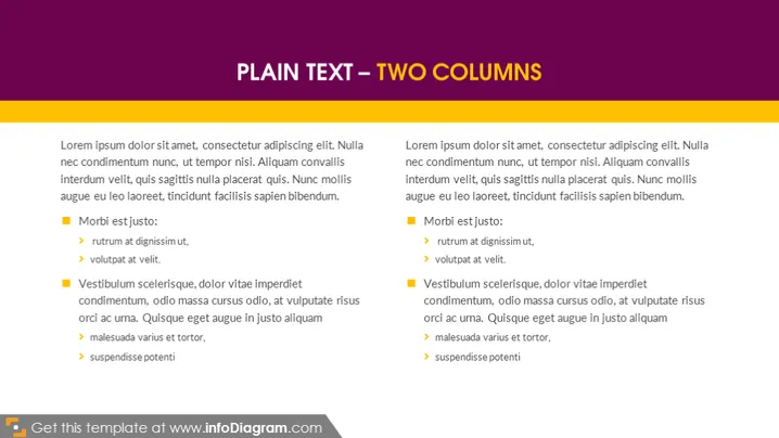
La diapositive présente une comparaison de deux sujets dans des colonnes séparées utilisant le texte d'espace réservé standard 'Lorem ipsum', qui est couramment utilisé dans l'industrie du design comme texte temporaire. Chaque colonne commence par la même phrase d'introduction puis se divise en deux sections mises en avant par des puces carrées avec des sous-éléments marqués par des flèches. Les sections sont étiquetées "Morbi est justo" et "Vestibulum scelerisque", suggérant deux points de discussion ou de comparaison distincts, bien que les significations de ces étiquettes soient floues en raison du texte latin générique.
Le design global est minimaliste et professionnel, focalisant l'attention du public sur le texte. La mise en page symétrique fournit une structure visuellement équilibrée, parfaite pour comparer ou afficher deux ensembles d'informations simultanément.



