Your graphics add a nice touch to my presentations and I recently used them for one of my all-hands meetings. Your toolbox adds professionalism to my slides. Instead of using standard clipart.
Claude Jones, Director of Engineer, @Walmartlabs, USA
Your graphics add a nice touch to my presentations and I recently used them for one of my all-hands meetings. Your toolbox adds professionalism to my slides. Instead of using standard clipart.
Claude Jones, Director of Engineer, @Walmartlabs, USA
I needed a fresh look at some of my slides. I've tried to find a way to create a paintbrush effect, to underline, accentuate, add some color and the handwritten markers were just the things. Very easy to use, easy to size, change the color. It was an affordable, perfect solution and I'm happy to recommend it.
Anonymous, US
The crisp, clean look of the graphics, and the fact that it allowed me to easily edit and change the colors to match the template was my main reason for purchasing them.
Brandie Jenkins, E-learning Developer, USA
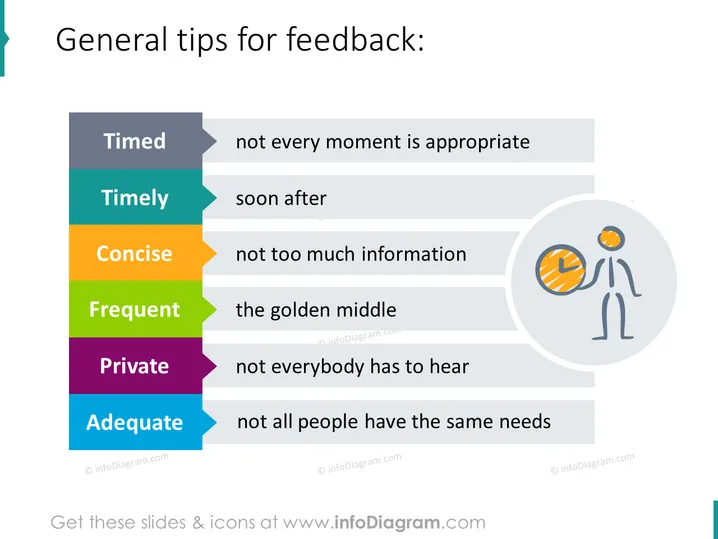
La diapositive PowerPoint fournit des directives pour donner des retours d'information, en mettant l'accent sur six concepts clés : Chronométré (tous les moments ne sont pas appropriés), Opportun (peu après l'événement), Concis (pas trop d'informations), Fréquent (le juste milieu), Privé (tout le monde n'a pas à entendre) et Adéquat (toutes les personnes n'ont pas les mêmes besoins). Chaque concept est un élément fondamental pour promouvoir une communication efficace, indiquant que les retours d'information doivent être soigneusement réfléchis, transmis rapidement, clairs et directs, donnés avec une fréquence appropriée, partagés discrètement et adaptés aux besoins de l'individu.


