

Your graphics add a nice touch to my presentations and I recently used them for one of my all-hands meetings. Your toolbox adds professionalism to my slides. Instead of using standard clipart.
Claude Jones, Director of Engineer, @Walmartlabs, USA

Your graphics add a nice touch to my presentations and I recently used them for one of my all-hands meetings. Your toolbox adds professionalism to my slides. Instead of using standard clipart.
Claude Jones, Director of Engineer, @Walmartlabs, USA
I needed a fresh look at some of my slides. I've tried to find a way to create a paintbrush effect, to underline, accentuate, add some color and the handwritten markers were just the things. Very easy to use, easy to size, change the color. It was an affordable, perfect solution and I'm happy to recommend it.
Anonymous, US
The crisp, clean look of the graphics, and the fact that it allowed me to easily edit and change the colors to match the template was my main reason for purchasing them.
Brandie Jenkins, E-learning Developer, USA
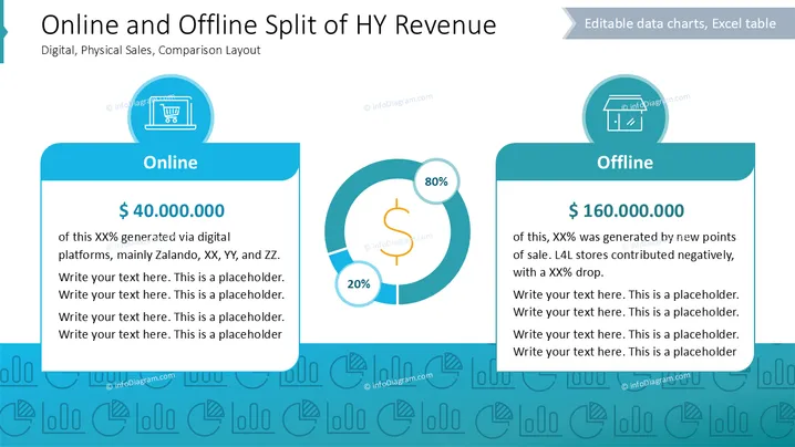
Cette diapositive présente une comparaison entre les répartitions des revenus en ligne et hors ligne. La section "En ligne" met en évidence 40 000 000 $ générés via des plateformes comme Zalando, avec un espace réservé pour un texte supplémentaire. La section "Hors ligne" montre 160 000 000 $ gagnés grâce à de nouveaux points de vente, avec un résumé des ventes en déclin dans les magasins L4L. Un graphique circulaire central affiche 20 % pour en ligne et 80 % pour hors ligne, offrant une représentation visuelle de cette répartition.
La diapositive utilise une mise en page propre et structurée avec des tons de bleu vifs et des visuels intuitifs comme des icônes et des graphiques pour différencier les flux de revenus en ligne et hors ligne.



