

Your graphics add a nice touch to my presentations and I recently used them for one of my all-hands meetings. Your toolbox adds professionalism to my slides. Instead of using standard clipart.
Claude Jones, Director of Engineer, @Walmartlabs, USA

Your graphics add a nice touch to my presentations and I recently used them for one of my all-hands meetings. Your toolbox adds professionalism to my slides. Instead of using standard clipart.
Claude Jones, Director of Engineer, @Walmartlabs, USA
I needed a fresh look at some of my slides. I've tried to find a way to create a paintbrush effect, to underline, accentuate, add some color and the handwritten markers were just the things. Very easy to use, easy to size, change the color. It was an affordable, perfect solution and I'm happy to recommend it.
Anonymous, US
The crisp, clean look of the graphics, and the fact that it allowed me to easily edit and change the colors to match the template was my main reason for purchasing them.
Brandie Jenkins, E-learning Developer, USA
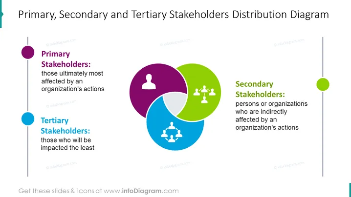
Cette diapositive présente le diagramme de distribution des parties prenantes primaires, secondaires et tertiaires. Les parties prenantes primaires désignent celles qui sont finalement les plus affectées par les actions d'une organisation, et les secondaires sont les personnes ou organisations qui sont indirectement affectées par les actions d'une organisation. Les parties prenantes tertiaires sont celles qui seront le moins impactées. Vous pouvez modifier les graphiques et ajouter un texte supplémentaire qui implique la situation de votre entreprise. Vous pouvez également télécharger cette présentation sur Google Slides et Keynote. Cliquez sur l'image pour voir plus d'idées d'analyse des parties prenantes.
Diagramme, Code Couleur, Vecteurs de Ligne, Points de Contact, Icône d'Homme, Icône de Personnes Interagissant.



