Your graphics add a nice touch to my presentations and I recently used them for one of my all-hands meetings. Your toolbox adds professionalism to my slides. Instead of using standard clipart.
Claude Jones, Director of Engineer, @Walmartlabs, USA
Your graphics add a nice touch to my presentations and I recently used them for one of my all-hands meetings. Your toolbox adds professionalism to my slides. Instead of using standard clipart.
Claude Jones, Director of Engineer, @Walmartlabs, USA
I needed a fresh look at some of my slides. I've tried to find a way to create a paintbrush effect, to underline, accentuate, add some color and the handwritten markers were just the things. Very easy to use, easy to size, change the color. It was an affordable, perfect solution and I'm happy to recommend it.
Anonymous, US
The crisp, clean look of the graphics, and the fact that it allowed me to easily edit and change the colors to match the template was my main reason for purchasing them.
Brandie Jenkins, E-learning Developer, USA
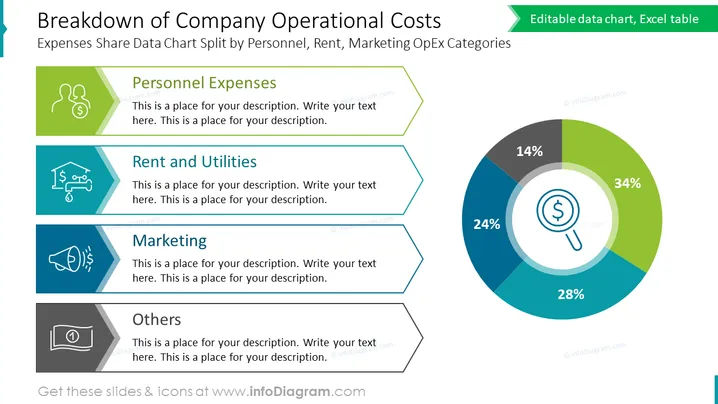
La diapositive PowerPoint présente une répartition des dépenses opérationnelles d'une entreprise en quatre catégories principales : Dépenses de Personnel, Loyer et Services Publics, Marketing et Autres. Chaque catégorie est représentée par une icône symbolique (deux icônes d'utilisateur connectées, une maison avec un engrenage, un mégaphone et un graphique en camembert respectivement) signifiant le type de dépense. Ces catégories sont ensuite quantifiées en pourcentages affichés dans un graphique en camembert, fournissant une représentation visuelle de la contribution de chaque catégorie aux coûts opérationnels totaux. Dépenses de Personnel (34 %), Loyer et Services Publics (28 %), Marketing (24 %) et Autres (14 %) détaillent collectivement la composition des dépenses.
La diapositive affiche un design propre et professionnel avec un schéma de couleurs cohérent qui utilise efficacement des icônes et un graphique en camembert pour transmettre visuellement les données.


