

Your graphics add a nice touch to my presentations and I recently used them for one of my all-hands meetings. Your toolbox adds professionalism to my slides. Instead of using standard clipart.
Claude Jones, Director of Engineer, @Walmartlabs, USA

Your graphics add a nice touch to my presentations and I recently used them for one of my all-hands meetings. Your toolbox adds professionalism to my slides. Instead of using standard clipart.
Claude Jones, Director of Engineer, @Walmartlabs, USA
I needed a fresh look at some of my slides. I've tried to find a way to create a paintbrush effect, to underline, accentuate, add some color and the handwritten markers were just the things. Very easy to use, easy to size, change the color. It was an affordable, perfect solution and I'm happy to recommend it.
Anonymous, US
The crisp, clean look of the graphics, and the fact that it allowed me to easily edit and change the colors to match the template was my main reason for purchasing them.
Brandie Jenkins, E-learning Developer, USA
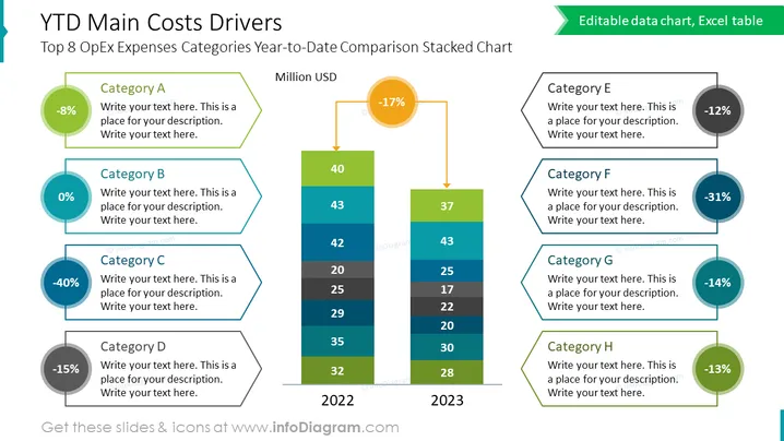
La diapositive présente le "Top 8 des Catégories de Dépenses OpEx Comparaison Cumulée Année-à-Date", visualisant huit catégories (A à H) avec des changements de pourcentages correspondants et des espaces pour des descriptions. Chaque catégorie illustre un changement dans les dépenses opérationnelles, par exemple, la Catégorie A montrant une diminution de 8%, la Catégorie B sans changement, et la Catégorie C avec une réduction significative de 40%. Le graphique à barres empilées au centre compare les coûts sur deux années, 2022 et 2023, mettant en évidence une diminution avec une flèche orange et une valeur en pourcentage.
La diapositive présente un design équilibré et coloré avec un accent central sur le graphique à barres empilées flanqué par des descriptions de catégorie. L'utilisation de la coordination des couleurs aide à relier les zones de texte à leurs données respectives dans le graphique.



