

Your graphics add a nice touch to my presentations and I recently used them for one of my all-hands meetings. Your toolbox adds professionalism to my slides. Instead of using standard clipart.
Claude Jones, Director of Engineer, @Walmartlabs, USA

Your graphics add a nice touch to my presentations and I recently used them for one of my all-hands meetings. Your toolbox adds professionalism to my slides. Instead of using standard clipart.
Claude Jones, Director of Engineer, @Walmartlabs, USA
I needed a fresh look at some of my slides. I've tried to find a way to create a paintbrush effect, to underline, accentuate, add some color and the handwritten markers were just the things. Very easy to use, easy to size, change the color. It was an affordable, perfect solution and I'm happy to recommend it.
Anonymous, US
The crisp, clean look of the graphics, and the fact that it allowed me to easily edit and change the colors to match the template was my main reason for purchasing them.
Brandie Jenkins, E-learning Developer, USA
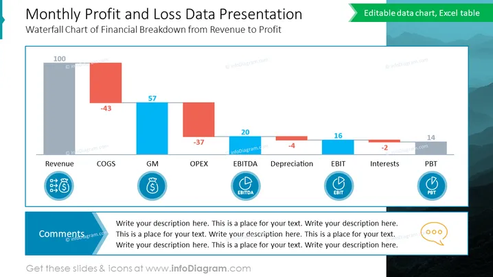
Cette diapositive PowerPoint présente un graphique en cascade de la répartition financière des revenus au profit, démontrant les données mensuelles de profit et de perte d'une entreprise. Le graphique inclut des valeurs numériques pour les revenus, le COGS (Coût des biens vendus), le GM (Marge brute), les OPEX (Dépenses opérationnelles), l'EBITDA (Bénéfice avant intérêts, impôts, amortissements et provisions), l'amortissement, l'EBIT (Bénéfice avant intérêts et impôts), les intérêts, et le PBT (Bénéfice avant impôt).
L'apparence générale de la diapositive est claire et professionnelle, avec une nette emphasis sur le graphique en cascade. Le schéma de couleurs aide à distinguer les chiffres financiers positifs et négatifs, et l'utilisation d'icônes aide à encapsuler visuellement les termes financiers.



