Your graphics add a nice touch to my presentations and I recently used them for one of my all-hands meetings. Your toolbox adds professionalism to my slides. Instead of using standard clipart.
Claude Jones, Director of Engineer, @Walmartlabs, USA
Your graphics add a nice touch to my presentations and I recently used them for one of my all-hands meetings. Your toolbox adds professionalism to my slides. Instead of using standard clipart.
Claude Jones, Director of Engineer, @Walmartlabs, USA
I needed a fresh look at some of my slides. I've tried to find a way to create a paintbrush effect, to underline, accentuate, add some color and the handwritten markers were just the things. Very easy to use, easy to size, change the color. It was an affordable, perfect solution and I'm happy to recommend it.
Anonymous, US
The crisp, clean look of the graphics, and the fact that it allowed me to easily edit and change the colors to match the template was my main reason for purchasing them.
Brandie Jenkins, E-learning Developer, USA
Malheureusement, sans texte dans l'image, je ne peux pas fournir le titre de la diapositive.
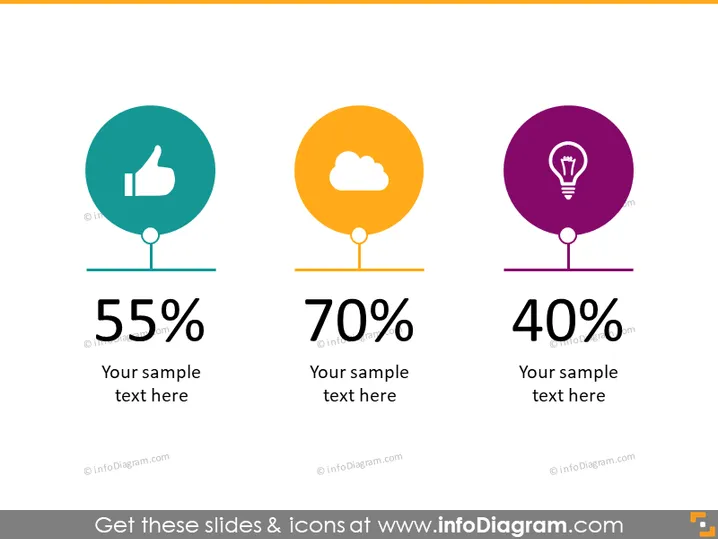
La diapositive PowerPoint présente une comparaison de trois métriques différentes, chacune avec une icône, un pourcentage et un champ de texte personnalisable. Les icônes signifient pouce levé, nuage et ampoule, indiquant potentiellement le taux de satisfaction, les services cloud ou la présence en ligne, et l'innovation ou les idées, respectivement. Chaque icône circulaire est associée à un pourcentage en gras — 55 %, 70 % et 40 % — suggérant divers niveaux d'accomplissement ou d'objectifs. Sous chaque pourcentage, il y a un espace réservé pour du texte qui peut être adapté pour fournir des informations spécifiques sur la métrique.
L'apparence générale de la diapositive est propre, moderne et visuellement engageante. L'utilisation de couleurs distinctes et d'icônes simples aide à transmettre les données dans un format facile à comprendre.


