

Your graphics add a nice touch to my presentations and I recently used them for one of my all-hands meetings. Your toolbox adds professionalism to my slides. Instead of using standard clipart.
Claude Jones, Director of Engineer, @Walmartlabs, USA

Your graphics add a nice touch to my presentations and I recently used them for one of my all-hands meetings. Your toolbox adds professionalism to my slides. Instead of using standard clipart.
Claude Jones, Director of Engineer, @Walmartlabs, USA
I needed a fresh look at some of my slides. I've tried to find a way to create a paintbrush effect, to underline, accentuate, add some color and the handwritten markers were just the things. Very easy to use, easy to size, change the color. It was an affordable, perfect solution and I'm happy to recommend it.
Anonymous, US
The crisp, clean look of the graphics, and the fact that it allowed me to easily edit and change the colors to match the template was my main reason for purchasing them.
Brandie Jenkins, E-learning Developer, USA
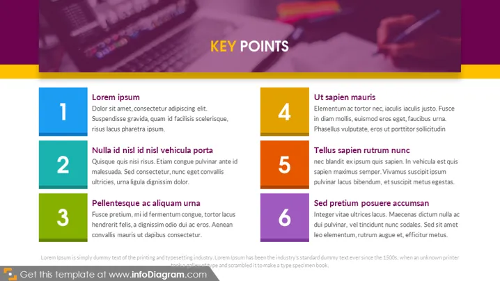
La diapositive semble présenter une liste de six points clés, chacun accompagné d'une brève explication pour développer le concept. Les points sont simplement intitulés "Lorem ipsum", "Nulla id nisl id nisl vehicula porta", "Pellentesque ac aliquam urna", "Ut sapien mauris", "Tellus sapien rutrum nunc" et "Sed pretium posuere accumsan". Ces noms suggèrent un texte de remplissage et non un contenu réel, ce qui est une pratique courante pendant la phase de rédaction de la conception d'une présentation, permettant la révision de la mise en page et du design avant de finaliser le texte.
Le style visuel utilise le contraste tant dans la couleur que dans la taille des éléments pour attirer l’attention sur les points clés. Le schéma de couleurs est cohérent et l'esthétique globale semble professionnelle et contemporaine.



