Your graphics add a nice touch to my presentations and I recently used them for one of my all-hands meetings. Your toolbox adds professionalism to my slides. Instead of using standard clipart.
Claude Jones, Director of Engineer, @Walmartlabs, USA
Your graphics add a nice touch to my presentations and I recently used them for one of my all-hands meetings. Your toolbox adds professionalism to my slides. Instead of using standard clipart.
Claude Jones, Director of Engineer, @Walmartlabs, USA
I needed a fresh look at some of my slides. I've tried to find a way to create a paintbrush effect, to underline, accentuate, add some color and the handwritten markers were just the things. Very easy to use, easy to size, change the color. It was an affordable, perfect solution and I'm happy to recommend it.
Anonymous, US
The crisp, clean look of the graphics, and the fact that it allowed me to easily edit and change the colors to match the template was my main reason for purchasing them.
Brandie Jenkins, E-learning Developer, USA
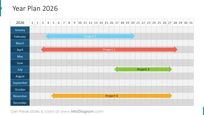
La diapositive présente un plan annuel pour 2026, incluant quatre projets présentés sur un diagramme de Gantt. Le Projet 1 s'étend de février à juin, utilisant une flèche bleue pour indiquer sa durée et sa direction. Le Projet 2, représenté par une flèche rouge, s'étend d'avril à octobre, tandis que le Projet 3, montré avec une flèche verte, se déroule de juillet à septembre. Enfin, le Projet 4 est marqué par une flèche jaune, couvrant novembre et décembre. Chaque flèche de projet inclut un libellé avec son numéro respectif.
L'aspect général de la diapositive est professionnel et épuré, avec une bonne utilisation de couleurs et de nuances contrastées pour distinguer les mois et les projets. Il est visuellement attrayant et communique immédiatement le concept de planification et de gestion du temps grâce à sa structure de type diagramme de Gantt.


