Your graphics add a nice touch to my presentations and I recently used them for one of my all-hands meetings. Your toolbox adds professionalism to my slides. Instead of using standard clipart.
Claude Jones, Director of Engineer, @Walmartlabs, USA
Your graphics add a nice touch to my presentations and I recently used them for one of my all-hands meetings. Your toolbox adds professionalism to my slides. Instead of using standard clipart.
Claude Jones, Director of Engineer, @Walmartlabs, USA
I needed a fresh look at some of my slides. I've tried to find a way to create a paintbrush effect, to underline, accentuate, add some color and the handwritten markers were just the things. Very easy to use, easy to size, change the color. It was an affordable, perfect solution and I'm happy to recommend it.
Anonymous, US
The crisp, clean look of the graphics, and the fact that it allowed me to easily edit and change the colors to match the template was my main reason for purchasing them.
Brandie Jenkins, E-learning Developer, USA
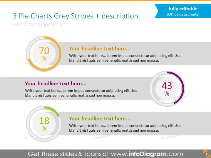
Contenu : La diapositive PowerPoint est intitulée "3 Graphiques Circulaires Rayures Grises + description – comparaison verticale", indiquant qu'elle est probablement utilisée pour comparer visuellement trois ensembles de données ou pourcentages différents à l'aide de graphiques circulaires. Chaque graphique circulaire a une valeur de pourcentage proéminente (70%, 43%, et 18%) et un espace pour un titre et un texte descriptif correspondants. L'utilisation de graphiques circulaires permet une comparaison facile des parts par rapport au tout, et les cases de texte accompagnantes fournissent un espace pour expliquer la signification ou le contexte de chaque graphique.
La diapositive est propre et visuellement équilibrée avec un design moderne qui met en avant les données par l'utilisation de couleurs et de contrastes. L'utilisation de rayures grises donne de la profondeur aux graphiques circulaires, et la mise en page fournit un flux structuré des données vers les informations accompagnantes.


