Your graphics add a nice touch to my presentations and I recently used them for one of my all-hands meetings. Your toolbox adds professionalism to my slides. Instead of using standard clipart.
Claude Jones, Director of Engineer, @Walmartlabs, USA
Your graphics add a nice touch to my presentations and I recently used them for one of my all-hands meetings. Your toolbox adds professionalism to my slides. Instead of using standard clipart.
Claude Jones, Director of Engineer, @Walmartlabs, USA
I needed a fresh look at some of my slides. I've tried to find a way to create a paintbrush effect, to underline, accentuate, add some color and the handwritten markers were just the things. Very easy to use, easy to size, change the color. It was an affordable, perfect solution and I'm happy to recommend it.
Anonymous, US
The crisp, clean look of the graphics, and the fact that it allowed me to easily edit and change the colors to match the template was my main reason for purchasing them.
Brandie Jenkins, E-learning Developer, USA
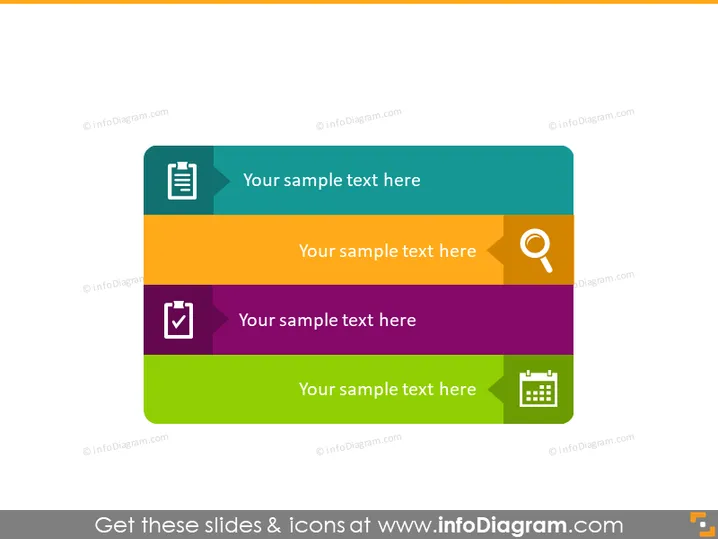
La diapositive semble être conçue pour présenter quatre points clés, services ou étapes de processus. Chaque segment a une couleur différente, ce qui peut aider à distinguer les sujets. Chaque section contient une icône qui représente probablement le sujet discuté. Par exemple, la première section comprend une icône de document, qui pourrait représenter le reporting ou la documentation. La deuxième avec une icône de loupe pourrait symboliser la recherche ou l'analyse, la troisième avec une coche peut suggérer des tâches complétées ou l'assurance qualité, et la quatrième avec un calendrier pourrait représenter la planification ou la programmation.
La diapositive est colorée avec un design propre et professionnel. L'utilisation d'icônes universelles et de couleurs contrastées rend le contenu facilement reconnaissable d'un coup d'œil.


