Your graphics add a nice touch to my presentations and I recently used them for one of my all-hands meetings. Your toolbox adds professionalism to my slides. Instead of using standard clipart.
Claude Jones, Director of Engineer, @Walmartlabs, USA
Your graphics add a nice touch to my presentations and I recently used them for one of my all-hands meetings. Your toolbox adds professionalism to my slides. Instead of using standard clipart.
Claude Jones, Director of Engineer, @Walmartlabs, USA
I needed a fresh look at some of my slides. I've tried to find a way to create a paintbrush effect, to underline, accentuate, add some color and the handwritten markers were just the things. Very easy to use, easy to size, change the color. It was an affordable, perfect solution and I'm happy to recommend it.
Anonymous, US
The crisp, clean look of the graphics, and the fact that it allowed me to easily edit and change the colors to match the template was my main reason for purchasing them.
Brandie Jenkins, E-learning Developer, USA
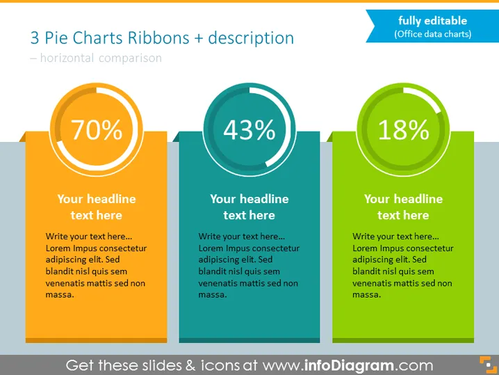
La diapositive présente une comparaison entre trois points de données différents à l'aide de graphiques en secteurs, chacun avec une forme de ruban correspondante et un texte descriptif. Le premier graphique en secteur montre un point de données de 70 %, suggérant une portion significative d'une entité ou d'un indicateur. Le deuxième graphique affiche un chiffre de 43 %, indiquant un segment plus petit par rapport au premier. Le troisième graphique a un point de données de 18 %, mettant en évidence la plus petite part parmi les éléments comparés. En dessous de chaque graphique en secteur se trouve un espace réservé pour un titre et un texte supplémentaire pour une explication plus détaillée.


