Your graphics add a nice touch to my presentations and I recently used them for one of my all-hands meetings. Your toolbox adds professionalism to my slides. Instead of using standard clipart.
Claude Jones, Director of Engineer, @Walmartlabs, USA
Your graphics add a nice touch to my presentations and I recently used them for one of my all-hands meetings. Your toolbox adds professionalism to my slides. Instead of using standard clipart.
Claude Jones, Director of Engineer, @Walmartlabs, USA
I needed a fresh look at some of my slides. I've tried to find a way to create a paintbrush effect, to underline, accentuate, add some color and the handwritten markers were just the things. Very easy to use, easy to size, change the color. It was an affordable, perfect solution and I'm happy to recommend it.
Anonymous, US
The crisp, clean look of the graphics, and the fact that it allowed me to easily edit and change the colors to match the template was my main reason for purchasing them.
Brandie Jenkins, E-learning Developer, USA
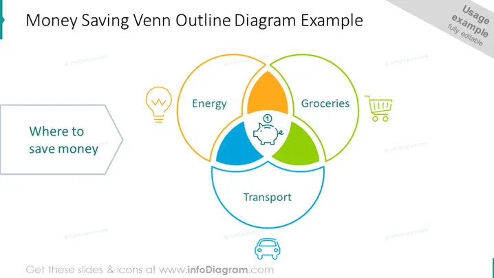
La diapositive présente un diagramme de Venn illustrant les domaines potentiels pour économiser de l'argent. Le diagramme a trois cercles qui se chevauchent, étiquetés "Énergie", "Transport" et "Produits alimentaires", chacun accompagné d'une icône représentant la catégorie (une ampoule pour l'énergie, un chariot pour les produits alimentaires et une voiture pour le transport). La zone centrale qui se chevauche est marquée par une icône de tirelire, symbolisant les principales opportunités d'économies d'argent où les trois catégories se croisent.
L'aspect général de la diapositive est simple et épuré, avec une utilisation ciblée d'icônes et de couleurs pour désigner différents domaines liés à l'économie d'argent. La structure visuelle est guidée par le diagramme de Venn, qui sert à illustrer les aspects interconnectés de la réduction des coûts.


