

Your graphics add a nice touch to my presentations and I recently used them for one of my all-hands meetings. Your toolbox adds professionalism to my slides. Instead of using standard clipart.
Claude Jones, Director of Engineer, @Walmartlabs, USA

Your graphics add a nice touch to my presentations and I recently used them for one of my all-hands meetings. Your toolbox adds professionalism to my slides. Instead of using standard clipart.
Claude Jones, Director of Engineer, @Walmartlabs, USA
I needed a fresh look at some of my slides. I've tried to find a way to create a paintbrush effect, to underline, accentuate, add some color and the handwritten markers were just the things. Very easy to use, easy to size, change the color. It was an affordable, perfect solution and I'm happy to recommend it.
Anonymous, US
The crisp, clean look of the graphics, and the fact that it allowed me to easily edit and change the colors to match the template was my main reason for purchasing them.
Brandie Jenkins, E-learning Developer, USA
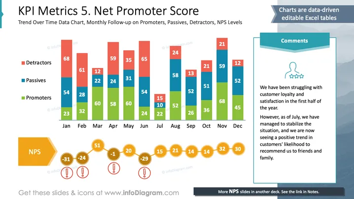
Cette diapositive illustre une analyse de l'indice de satisfaction du client (NPS) sur une année. Elle présente des tendances mensuelles pour trois groupes de clients : les Critiques qui critiquent le service, impactant négativement le NPS. Les Passifs sont indifférents, ayant peu d'effet sur le NPS. Les Promoteurs recommandent le service, augmentant le NPS. Les commentaires notent une satisfaction client initialement faible qui s'améliore à partir de juillet, comme l'indiquent l'augmentation des Promoteurs et la diminution des Critiques.
Dans l'ensemble, la diapositive combine efficacement la visualisation des données avec des éléments narratifs. Les couleurs du graphique contrastent bien, rendant différentes catégories de données facilement distinguables.



