

Your graphics add a nice touch to my presentations and I recently used them for one of my all-hands meetings. Your toolbox adds professionalism to my slides. Instead of using standard clipart.
Claude Jones, Director of Engineer, @Walmartlabs, USA

Your graphics add a nice touch to my presentations and I recently used them for one of my all-hands meetings. Your toolbox adds professionalism to my slides. Instead of using standard clipart.
Claude Jones, Director of Engineer, @Walmartlabs, USA
I needed a fresh look at some of my slides. I've tried to find a way to create a paintbrush effect, to underline, accentuate, add some color and the handwritten markers were just the things. Very easy to use, easy to size, change the color. It was an affordable, perfect solution and I'm happy to recommend it.
Anonymous, US
The crisp, clean look of the graphics, and the fact that it allowed me to easily edit and change the colors to match the template was my main reason for purchasing them.
Brandie Jenkins, E-learning Developer, USA
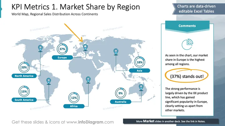
La diapositive illustre un aperçu mondial de la distribution de la part de marché à travers diverses régions. L'Europe est en tête avec 37%, soulignant sa présence significative sur le marché. L'Amérique du Nord suit avec une part de 20%, indiquant une forte performance. L'Asie détient une part de 18%, reflétant un engagement substantiel. L'Amérique du Sud et l'Afrique représentent respectivement 15% et 12%, montrant une participation modérée. L'Australie contribue avec une part de 9%, la plus petite parmi les régions.
La diapositive utilise une visualisation cartographique claire, affichant efficacement des données avec des icônes et des pourcentages. Les éléments de design se concentrent sur la signification et la clarté, contribuant à communiquer des informations financières de manière concise.



