

Your graphics add a nice touch to my presentations and I recently used them for one of my all-hands meetings. Your toolbox adds professionalism to my slides. Instead of using standard clipart.
Claude Jones, Director of Engineer, @Walmartlabs, USA

Your graphics add a nice touch to my presentations and I recently used them for one of my all-hands meetings. Your toolbox adds professionalism to my slides. Instead of using standard clipart.
Claude Jones, Director of Engineer, @Walmartlabs, USA
I needed a fresh look at some of my slides. I've tried to find a way to create a paintbrush effect, to underline, accentuate, add some color and the handwritten markers were just the things. Very easy to use, easy to size, change the color. It was an affordable, perfect solution and I'm happy to recommend it.
Anonymous, US
The crisp, clean look of the graphics, and the fact that it allowed me to easily edit and change the colors to match the template was my main reason for purchasing them.
Brandie Jenkins, E-learning Developer, USA
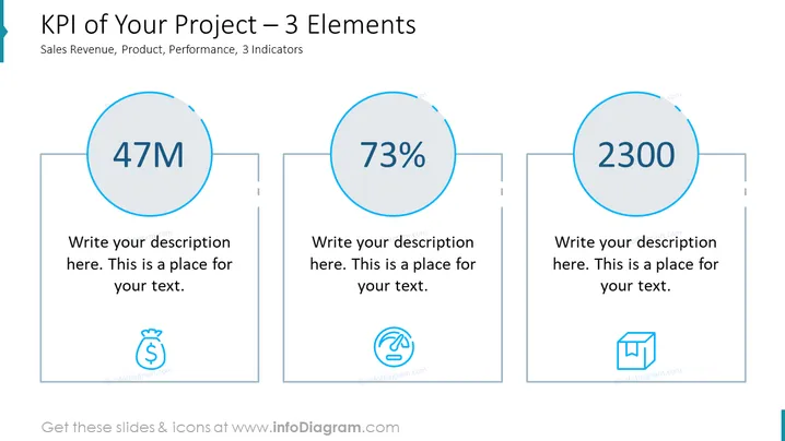
La diapositive présente trois Indicateurs Clés de Performance (KPI) liés à un projet, catégorisés par Chiffre d'Affaires, Produit et Performance. Chaque indicateur affiche un grand nombre central – "47M," "73%," et "2300," représentant respectivement une valeur monétaire, un pourcentage et un compte ou score. Sous chaque nombre, il y a un espace réservé pour une description, impliquant que des détails supplémentaires devraient être ajoutés pour contextualiser ces chiffres. Des icônes accompagnantes suggèrent la nature de chaque KPI : un sac d'argent pour le Chiffre d'Affaires, un doigt glissant sur une surface numérique pour le Produit, et une boîte pour la Performance.
La diapositive présente un design propre et minimaliste avec un espace blanc ample autour des éléments, créant une expérience visuelle dégagée. L'utilisation d'icônes aide à une compréhension rapide des KPI représentés.



