Your graphics add a nice touch to my presentations and I recently used them for one of my all-hands meetings. Your toolbox adds professionalism to my slides. Instead of using standard clipart.
Claude Jones, Director of Engineer, @Walmartlabs, USA
Your graphics add a nice touch to my presentations and I recently used them for one of my all-hands meetings. Your toolbox adds professionalism to my slides. Instead of using standard clipart.
Claude Jones, Director of Engineer, @Walmartlabs, USA
I needed a fresh look at some of my slides. I've tried to find a way to create a paintbrush effect, to underline, accentuate, add some color and the handwritten markers were just the things. Very easy to use, easy to size, change the color. It was an affordable, perfect solution and I'm happy to recommend it.
Anonymous, US
The crisp, clean look of the graphics, and the fact that it allowed me to easily edit and change the colors to match the template was my main reason for purchasing them.
Brandie Jenkins, E-learning Developer, USA
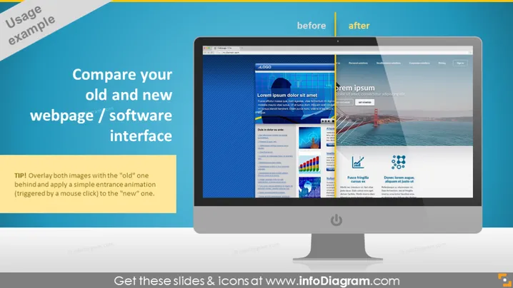
La diapositive PowerPoint est conçue pour illustrer une comparaison entre une ancienne et une nouvelle page web ou interface logicielle. La diapositive suggère d'utiliser une superposition des deux images, avec l'ancienne interface positionnée derrière la nouvelle, et d'incorporer une simple animation d'entrée pour passer de l'ancienne interface à la nouvelle lorsqu'elle est déclenchée par un clic de souris. Cela peut mettre en évidence visuellement les améliorations et les changements apportés à l'actif numérique, et c'est un moyen utile pour les audiences d'apprécier l'évolution de l'interface utilisateur d'un site web ou d'un logiciel.
L'apparence générale de la diapositive est moderne et visuellement engageante, avec une claire démarcation entre les états avant et après grâce à l'utilisation de couleurs contrastantes et d'étiquettes textuelles. L'illustration centrale du moniteur d'ordinateur attire efficacement les yeux du spectateur sur la comparaison présentée.


