Your graphics add a nice touch to my presentations and I recently used them for one of my all-hands meetings. Your toolbox adds professionalism to my slides. Instead of using standard clipart.
Claude Jones, Director of Engineer, @Walmartlabs, USA
Your graphics add a nice touch to my presentations and I recently used them for one of my all-hands meetings. Your toolbox adds professionalism to my slides. Instead of using standard clipart.
Claude Jones, Director of Engineer, @Walmartlabs, USA
I needed a fresh look at some of my slides. I've tried to find a way to create a paintbrush effect, to underline, accentuate, add some color and the handwritten markers were just the things. Very easy to use, easy to size, change the color. It was an affordable, perfect solution and I'm happy to recommend it.
Anonymous, US
The crisp, clean look of the graphics, and the fact that it allowed me to easily edit and change the colors to match the template was my main reason for purchasing them.
Brandie Jenkins, E-learning Developer, USA
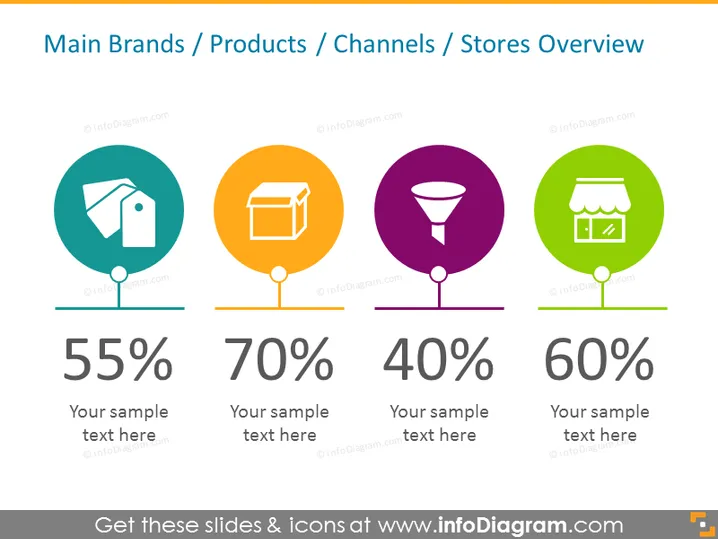
Cette diapositive offre un aperçu visuel de différents indicateurs pour les principales marques, produits, canaux ou magasins. Elle contient quatre sections distinctes, chacune avec une icône de cercle coloré, une image unique représentant différents aspects de l'entreprise, un grand chiffre de pourcentage et un espace réservé pour du texte supplémentaire. La première icône semble représenter une étiquette, suggérant l'identification de la marque ou des ventes, affichant 55 % avec un espace réservé pour une explication textuelle. La seconde avec une icône de boîte représente probablement les produits, affichant 70 % et un espace de texte exemple. La troisième présente un entonnoir, indiquant des canaux de vente ou de marketing, associé à 40 % et un espace pour un texte descriptif. La dernière icône représente un magasin, impliquant des emplacements de vente au détail physiques ou des indicateurs de performance des magasins, affichant 60 % et un espace texte exemple.
La diapositive est propre et minimaliste, utilisant des couleurs vives et des graphiques simples pour transmettre rapidement l'information. La hiérarchie visuelle est claire, dirigeant l'attention vers les icônes et les pourcentages, suivis de texte de soutien.


