

Your graphics add a nice touch to my presentations and I recently used them for one of my all-hands meetings. Your toolbox adds professionalism to my slides. Instead of using standard clipart.
Claude Jones, Director of Engineer, @Walmartlabs, USA

Your graphics add a nice touch to my presentations and I recently used them for one of my all-hands meetings. Your toolbox adds professionalism to my slides. Instead of using standard clipart.
Claude Jones, Director of Engineer, @Walmartlabs, USA
I needed a fresh look at some of my slides. I've tried to find a way to create a paintbrush effect, to underline, accentuate, add some color and the handwritten markers were just the things. Very easy to use, easy to size, change the color. It was an affordable, perfect solution and I'm happy to recommend it.
Anonymous, US
The crisp, clean look of the graphics, and the fact that it allowed me to easily edit and change the colors to match the template was my main reason for purchasing them.
Brandie Jenkins, E-learning Developer, USA
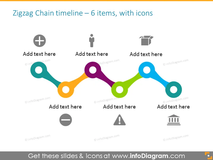
La diapositive présente une chronologie en zigzag qui comprend six éléments distincts, chacun accompagné d'une icône et d'un espace réservé pour le texte. Les icônes représentent différents concepts : un signe plus indiquant l'addition ou le commencement, une figure humaine simple désignant peut-être le personnel ou les ressources humaines, un chapeau symbolisant l'éducation ou la réussite, un signe moins pour la suppression ou la réduction, un triangle d'avertissement pour les risques ou les avertissements potentiels, et une icône de bâtiment suggérant l'infrastructure ou les institutions. Chaque concept implique une étape dans un processus séquentiel ou met en évidence une étape importante.
L'apparence générale de la diapositive est moderne et visuellement attrayante, avec une palette de couleurs douces qui attire l'attention sur la chronologie. L'agencement ordonné des icônes et des zones de texte facilite le suivi de l'information.



