

Your graphics add a nice touch to my presentations and I recently used them for one of my all-hands meetings. Your toolbox adds professionalism to my slides. Instead of using standard clipart.
Claude Jones, Director of Engineer, @Walmartlabs, USA

Your graphics add a nice touch to my presentations and I recently used them for one of my all-hands meetings. Your toolbox adds professionalism to my slides. Instead of using standard clipart.
Claude Jones, Director of Engineer, @Walmartlabs, USA
I needed a fresh look at some of my slides. I've tried to find a way to create a paintbrush effect, to underline, accentuate, add some color and the handwritten markers were just the things. Very easy to use, easy to size, change the color. It was an affordable, perfect solution and I'm happy to recommend it.
Anonymous, US
The crisp, clean look of the graphics, and the fact that it allowed me to easily edit and change the colors to match the template was my main reason for purchasing them.
Brandie Jenkins, E-learning Developer, USA
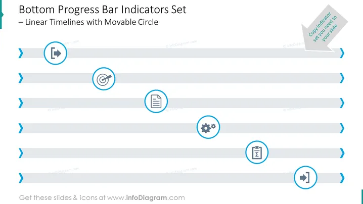
La diapositive semble illustrer un "Ensemble d'indicateurs de barre de progression inférieure – Lignes de temps linéaires avec un cercle mobile". Elle visualise un concept où diverses étapes ou éléments de progression sont marqués le long d'une ligne horizontale de suivi, chacun avec une icône distinctive représentant un aspect différent, comme une cible, un document, des réglages, un graphique ou une direction. Un tel design peut être utilisé pour représenter un flux de processus, l'achèvement de tâches, des jalons ou une chronologie de manière structurée et visuellement attrayante.
L'apparence générale de la diapositive est professionnelle, utilisant un langage de design épuré et minimaliste. L'utilisation de bleus clairs et foncés crée un effet visuel contrasté plaisant qui guide l'œil du spectateur le long de la progression de la chronologie.



