Your graphics add a nice touch to my presentations and I recently used them for one of my all-hands meetings. Your toolbox adds professionalism to my slides. Instead of using standard clipart.
Claude Jones, Director of Engineer, @Walmartlabs, USA
Your graphics add a nice touch to my presentations and I recently used them for one of my all-hands meetings. Your toolbox adds professionalism to my slides. Instead of using standard clipart.
Claude Jones, Director of Engineer, @Walmartlabs, USA
I needed a fresh look at some of my slides. I've tried to find a way to create a paintbrush effect, to underline, accentuate, add some color and the handwritten markers were just the things. Very easy to use, easy to size, change the color. It was an affordable, perfect solution and I'm happy to recommend it.
Anonymous, US
The crisp, clean look of the graphics, and the fact that it allowed me to easily edit and change the colors to match the template was my main reason for purchasing them.
Brandie Jenkins, E-learning Developer, USA
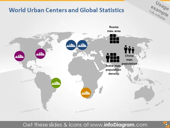
La diapositive fournit une représentation visuelle des statistiques mondiales liées aux centres urbains et à la démographie. Elle affiche des icônes indiquant la superficie maximale pour la Russie, la population maximale pour la Chine et la densité de population maximale pour l'Inde, chacune associée à un graphique à barres distinct. Les graphiques à barres représentent des magnitudes variées de données quantitatives, liant les éléments visuels à des statistiques géographiques et démographiques réelles.
La diapositive a un design propre et moderne, utilisant des éléments codés par couleur pour une distinction claire entre différents points de données.


