

Your graphics add a nice touch to my presentations and I recently used them for one of my all-hands meetings. Your toolbox adds professionalism to my slides. Instead of using standard clipart.
Claude Jones, Director of Engineer, @Walmartlabs, USA

Your graphics add a nice touch to my presentations and I recently used them for one of my all-hands meetings. Your toolbox adds professionalism to my slides. Instead of using standard clipart.
Claude Jones, Director of Engineer, @Walmartlabs, USA
I needed a fresh look at some of my slides. I've tried to find a way to create a paintbrush effect, to underline, accentuate, add some color and the handwritten markers were just the things. Very easy to use, easy to size, change the color. It was an affordable, perfect solution and I'm happy to recommend it.
Anonymous, US
The crisp, clean look of the graphics, and the fact that it allowed me to easily edit and change the colors to match the template was my main reason for purchasing them.
Brandie Jenkins, E-learning Developer, USA
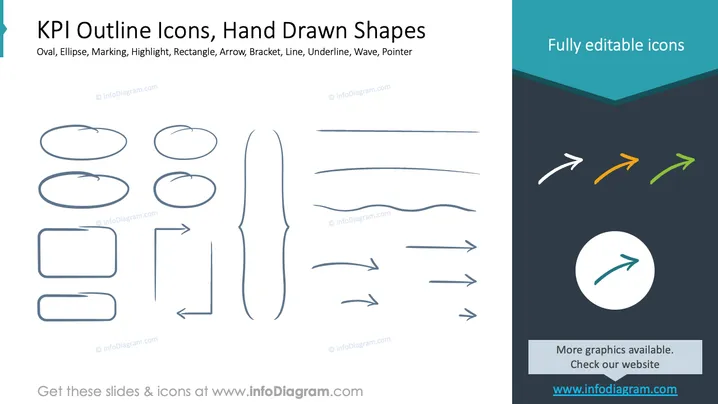
La diapositive présente une collection d'icônes de contour KPI dessinées à la main et de formes. Celles-ci incluent des ovales pour mettre en évidence des points de données importants, des ellipses pour marquer des notes spécifiques, et des rectangles pour encadrer du texte ou des informations. Des flèches indiquent la direction ou le flux, tandis que des crochets peuvent regrouper des éléments connexes. Des lignes et des lignes ondulées servent de séparateurs ou soulignent des informations. Des pointeurs attirent l'attention des participants sur des parties cruciales de la présentation.
Dans l'ensemble, la diapositive a un design minimaliste, mettant en avant diverses formes dessinées à la main. Les icônes et les formes sont faciles à personnaliser pour une communication visuelle claire.



