Your graphics add a nice touch to my presentations and I recently used them for one of my all-hands meetings. Your toolbox adds professionalism to my slides. Instead of using standard clipart.
Claude Jones, Director of Engineer, @Walmartlabs, USA
Your graphics add a nice touch to my presentations and I recently used them for one of my all-hands meetings. Your toolbox adds professionalism to my slides. Instead of using standard clipart.
Claude Jones, Director of Engineer, @Walmartlabs, USA
I needed a fresh look at some of my slides. I've tried to find a way to create a paintbrush effect, to underline, accentuate, add some color and the handwritten markers were just the things. Very easy to use, easy to size, change the color. It was an affordable, perfect solution and I'm happy to recommend it.
Anonymous, US
The crisp, clean look of the graphics, and the fact that it allowed me to easily edit and change the colors to match the template was my main reason for purchasing them.
Brandie Jenkins, E-learning Developer, USA
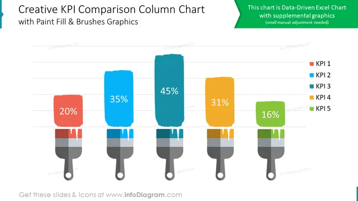
La diapositive PowerPoint présente un graphique à colonnes comparatives pour visualiser les Indicateurs Clés de Performance (KPI). Le graphique affiche cinq KPI : KPI 1, KPI 2, KPI 3, KPI 4 et KPI 5. Les valeurs de chaque KPI sont représentées par la hauteur des colonnes correspondantes. Le graphique utilise des remplissages de peinture et des graphiques de pinceaux pour améliorer l'attrait visuel de la comparaison des données. Le graphique comprend une note indiquant qu'il s'agit d'un graphique Excel basé sur des données avec des graphiques complémentaires.
Vous pouvez utiliser une telle diapositive dans divers contextes, tels que :


