Your graphics add a nice touch to my presentations and I recently used them for one of my all-hands meetings. Your toolbox adds professionalism to my slides. Instead of using standard clipart.
Claude Jones, Director of Engineer, @Walmartlabs, USA
Your graphics add a nice touch to my presentations and I recently used them for one of my all-hands meetings. Your toolbox adds professionalism to my slides. Instead of using standard clipart.
Claude Jones, Director of Engineer, @Walmartlabs, USA
I needed a fresh look at some of my slides. I've tried to find a way to create a paintbrush effect, to underline, accentuate, add some color and the handwritten markers were just the things. Very easy to use, easy to size, change the color. It was an affordable, perfect solution and I'm happy to recommend it.
Anonymous, US
The crisp, clean look of the graphics, and the fact that it allowed me to easily edit and change the colors to match the template was my main reason for purchasing them.
Brandie Jenkins, E-learning Developer, USA
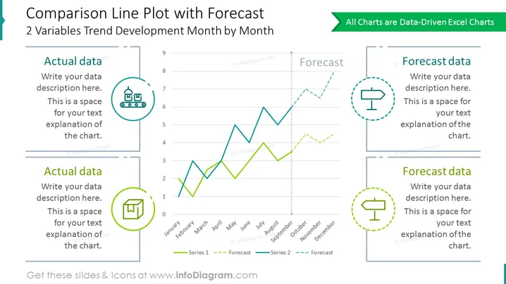
Diapositive de comparaison contenant un graphique à deux lignes pour le développement des tendances de deux variables mois par mois. Utilisez-le pour comparer les données réelles et prévisionnelles. Discutez des tendances sur l'année et résumez vos conclusions dans des conteneurs de description illustrés sur les côtés du diagramme.
Ce Graphique Linéaire de Comparaison Montrant le Diagramme des Tendances de Prévision fait partie de notre Modèle PPT de Graphiques Basés sur des Données de Graphique Linéaire.


