Your graphics add a nice touch to my presentations and I recently used them for one of my all-hands meetings. Your toolbox adds professionalism to my slides. Instead of using standard clipart.
Claude Jones, Director of Engineer, @Walmartlabs, USA
Your graphics add a nice touch to my presentations and I recently used them for one of my all-hands meetings. Your toolbox adds professionalism to my slides. Instead of using standard clipart.
Claude Jones, Director of Engineer, @Walmartlabs, USA
I needed a fresh look at some of my slides. I've tried to find a way to create a paintbrush effect, to underline, accentuate, add some color and the handwritten markers were just the things. Very easy to use, easy to size, change the color. It was an affordable, perfect solution and I'm happy to recommend it.
Anonymous, US
The crisp, clean look of the graphics, and the fact that it allowed me to easily edit and change the colors to match the template was my main reason for purchasing them.
Brandie Jenkins, E-learning Developer, USA
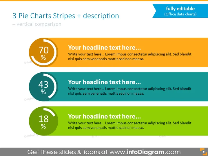
La diapositive PowerPoint présente une comparaison de trois valeurs statistiques à l'aide de graphiques en secteurs et d'un texte d'accompagnement. Chaque graphique a un pourcentage élevé au centre, suggérant qu'ils mesurent des parties d'un tout. Le premier graphique est orange avec 70%, le deuxième est teal avec 43%, et le troisième est vert avec 18%. Les graphiques en secteurs sont associés à des titres et textes de remplacement, indiquant un modèle qui peut être personnalisé avec des données et descriptions spécifiques. Les trois sections offrent une hiérarchie visuelle claire pour comparer les valeurs en pourcentage et fournissent un espace pour du contenu descriptif.


