Your graphics add a nice touch to my presentations and I recently used them for one of my all-hands meetings. Your toolbox adds professionalism to my slides. Instead of using standard clipart.
Claude Jones, Director of Engineer, @Walmartlabs, USA
Your graphics add a nice touch to my presentations and I recently used them for one of my all-hands meetings. Your toolbox adds professionalism to my slides. Instead of using standard clipart.
Claude Jones, Director of Engineer, @Walmartlabs, USA
I needed a fresh look at some of my slides. I've tried to find a way to create a paintbrush effect, to underline, accentuate, add some color and the handwritten markers were just the things. Very easy to use, easy to size, change the color. It was an affordable, perfect solution and I'm happy to recommend it.
Anonymous, US
The crisp, clean look of the graphics, and the fact that it allowed me to easily edit and change the colors to match the template was my main reason for purchasing them.
Brandie Jenkins, E-learning Developer, USA
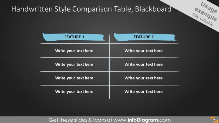
La diapositive intitulée "Tableau de comparaison de styles manuscrits, tableau noir" est conçue pour comparer deux ensembles de caractéristiques ou d'idées, avec une mise en page ressemblant à un tableau noir. Elle comporte deux colonnes, chacune intitulée "CARACTÉRISTIQUE 1" et "CARACTÉRISTIQUE 2" respectivement, dans un style de police manuscrite. Chaque colonne de caractéristiques a de l'espace pour quatre points de comparaison. Cette structure permet une évaluation facile côte à côte de différents concepts ou produits.
L'apparence générale de la diapositive imite un tableau noir de salle de classe, donnant une atmosphère décontractée et éducative. Le style de police manuscrite utilisé pour le titre et les en-têtes des caractéristiques transmet une touche personnalisée.


