Your graphics add a nice touch to my presentations and I recently used them for one of my all-hands meetings. Your toolbox adds professionalism to my slides. Instead of using standard clipart.
Claude Jones, Director of Engineer, @Walmartlabs, USA
Your graphics add a nice touch to my presentations and I recently used them for one of my all-hands meetings. Your toolbox adds professionalism to my slides. Instead of using standard clipart.
Claude Jones, Director of Engineer, @Walmartlabs, USA
I needed a fresh look at some of my slides. I've tried to find a way to create a paintbrush effect, to underline, accentuate, add some color and the handwritten markers were just the things. Very easy to use, easy to size, change the color. It was an affordable, perfect solution and I'm happy to recommend it.
Anonymous, US
The crisp, clean look of the graphics, and the fact that it allowed me to easily edit and change the colors to match the template was my main reason for purchasing them.
Brandie Jenkins, E-learning Developer, USA
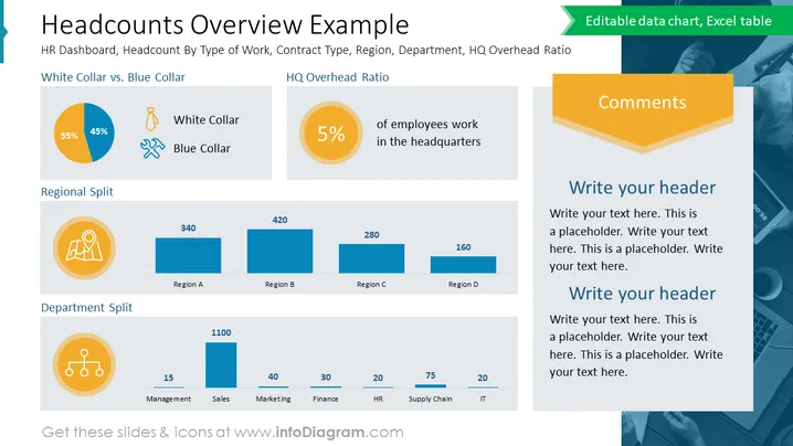
La diapositive présente une répartition statistique de la main-d'œuvre d'une organisation, catégorisée par type de poste, répartition régionale et allocation départementale. Elle comprend un diagramme circulaire "Col Blanc vs. Col Bleu" montrant une répartition de 55% à 45%, un "Ratio des Frais Généraux du Siège" soulignant que 5% des employés travaillent au siège, une "Répartition Régionale" avec des distributions numériques à travers quatre régions, et une "Répartition par Département" fournissant des chiffres d'effectifs pour les départements de gestion, ventes, marketing, finance, RH, chaîne d'approvisionnement et informatique. Chaque section est accompagnée d'icônes qui représentent visuellement les catégories, soulignant les divisions des données et permettant une compréhension rapide de la démographie structurelle de l'entreprise.
La diapositive a une mise en page bien organisée avec des sections clairement définies pour différents points de données et une palette de couleurs harmonieuse. Les icônes et graphiques sont utilisés de manière efficace pour illustrer l'information quantitative, permettant une interprétation visuelle rapide.


