Your graphics add a nice touch to my presentations and I recently used them for one of my all-hands meetings. Your toolbox adds professionalism to my slides. Instead of using standard clipart.
Claude Jones, Director of Engineer, @Walmartlabs, USA
Your graphics add a nice touch to my presentations and I recently used them for one of my all-hands meetings. Your toolbox adds professionalism to my slides. Instead of using standard clipart.
Claude Jones, Director of Engineer, @Walmartlabs, USA
I needed a fresh look at some of my slides. I've tried to find a way to create a paintbrush effect, to underline, accentuate, add some color and the handwritten markers were just the things. Very easy to use, easy to size, change the color. It was an affordable, perfect solution and I'm happy to recommend it.
Anonymous, US
The crisp, clean look of the graphics, and the fact that it allowed me to easily edit and change the colors to match the template was my main reason for purchasing them.
Brandie Jenkins, E-learning Developer, USA
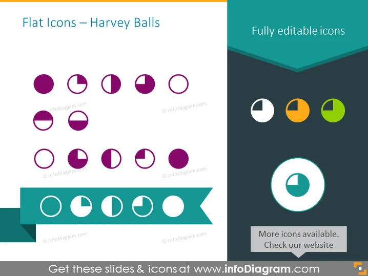
La diapositive illustre comment les cercles de Harvey peuvent être utilisés comme icônes plates pour représenter différents niveaux de complétion ou de satisfaction. Ces indicateurs graphiques sont couramment utilisés pour visualiser des informations qualitatives. Chaque cercle de Harvey sur la diapositive représente un degré varié de complétion d'un cercle, de plein à vide. Cela fournit une méthode visuelle simple pour comparer différents éléments ou catégories en fonction du degré auquel chacun a rempli un certain critère. Par exemple, un cercle plein pourrait indiquer 100 % de complétion, tandis qu'un cercle à moitié rempli pourrait représenter un taux de complétion de 50 %.
La diapositive a un look moderne et épuré avec une forte utilisation de la géométrie et du contraste des couleurs. Le côté gauche de la diapositive présente des teintes de violet plus traditionnelles tandis que le droit affiche une palette plus vibrante, augmentant l'intérêt visuel.


