

Your graphics add a nice touch to my presentations and I recently used them for one of my all-hands meetings. Your toolbox adds professionalism to my slides. Instead of using standard clipart.
Claude Jones, Director of Engineer, @Walmartlabs, USA

Your graphics add a nice touch to my presentations and I recently used them for one of my all-hands meetings. Your toolbox adds professionalism to my slides. Instead of using standard clipart.
Claude Jones, Director of Engineer, @Walmartlabs, USA
I needed a fresh look at some of my slides. I've tried to find a way to create a paintbrush effect, to underline, accentuate, add some color and the handwritten markers were just the things. Very easy to use, easy to size, change the color. It was an affordable, perfect solution and I'm happy to recommend it.
Anonymous, US
The crisp, clean look of the graphics, and the fact that it allowed me to easily edit and change the colors to match the template was my main reason for purchasing them.
Brandie Jenkins, E-learning Developer, USA
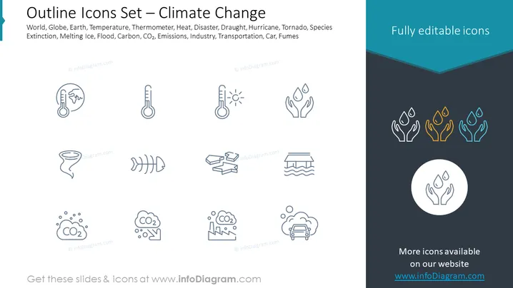
La diapositive est une collection d'icônes en contour liées au changement climatique, comprenant des représentations visuelles du monde/globe, température/thermomètre, chaleur, catastrophe, sécheresse, ouragan, tornade, extinction des espèces, fonte des glaces, inondation, carbone/CO2, émissions, industrie, transport, voiture, et fumées. Chaque icône est associée à un mot-clé qui aide à comprendre les différents aspects du changement climatique. Par exemple, l’icône d'un globe représente l'impact mondial du changement climatique, tandis que l'icône de la fonte des glaces souligne les conséquences du réchauffement climatique.
La diapositive a une esthétique propre et professionnelle avec une claire dédicace à la représentation de divers aspects liés au changement climatique à travers un ensemble d'icônes simples et élégantes. L'utilisation de la couleur est minimale, attirant l'attention sur les icônes présentées comme des exemples entièrement éditables.



