Your graphics add a nice touch to my presentations and I recently used them for one of my all-hands meetings. Your toolbox adds professionalism to my slides. Instead of using standard clipart.
Claude Jones, Director of Engineer, @Walmartlabs, USA
Your graphics add a nice touch to my presentations and I recently used them for one of my all-hands meetings. Your toolbox adds professionalism to my slides. Instead of using standard clipart.
Claude Jones, Director of Engineer, @Walmartlabs, USA
I needed a fresh look at some of my slides. I've tried to find a way to create a paintbrush effect, to underline, accentuate, add some color and the handwritten markers were just the things. Very easy to use, easy to size, change the color. It was an affordable, perfect solution and I'm happy to recommend it.
Anonymous, US
The crisp, clean look of the graphics, and the fact that it allowed me to easily edit and change the colors to match the template was my main reason for purchasing them.
Brandie Jenkins, E-learning Developer, USA
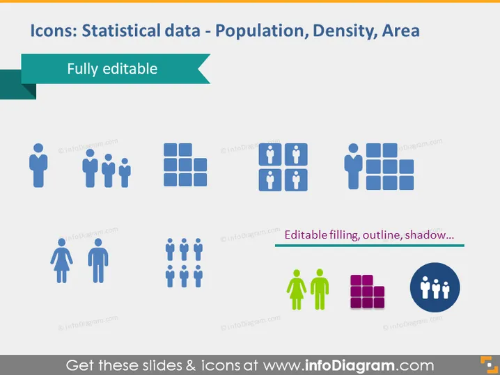
La diapositive PowerPoint fournit une collection d'icônes liées aux données statistiques, représentant spécifiquement la population, la densité et la superficie. Ces icônes peuvent être entièrement modifiées en termes de remplissage, de contour et d'ombre, permettant une utilisation polyvalente dans les présentations. Il y a des icônes représentant des individus et des groupes de personnes, une grille carrée symbolisant la zone, et une unité familiale représentant la densité de population.
La diapositive a une disposition épurée et moderne avec un schéma de couleurs cohérent, utilisant principalement des bleus, des verts, et une touche de vert et de violet contrastants pour l'accentuation. Les icônes sont simples et facilement reconnaissables, les rendant idéales pour illustrer des concepts statistiques.


