Your graphics add a nice touch to my presentations and I recently used them for one of my all-hands meetings. Your toolbox adds professionalism to my slides. Instead of using standard clipart.
Claude Jones, Director of Engineer, @Walmartlabs, USA
Your graphics add a nice touch to my presentations and I recently used them for one of my all-hands meetings. Your toolbox adds professionalism to my slides. Instead of using standard clipart.
Claude Jones, Director of Engineer, @Walmartlabs, USA
I needed a fresh look at some of my slides. I've tried to find a way to create a paintbrush effect, to underline, accentuate, add some color and the handwritten markers were just the things. Very easy to use, easy to size, change the color. It was an affordable, perfect solution and I'm happy to recommend it.
Anonymous, US
The crisp, clean look of the graphics, and the fact that it allowed me to easily edit and change the colors to match the template was my main reason for purchasing them.
Brandie Jenkins, E-learning Developer, USA
L'image ne contient pas de titre de diapositive clair, donc je ne peux pas en fournir un.
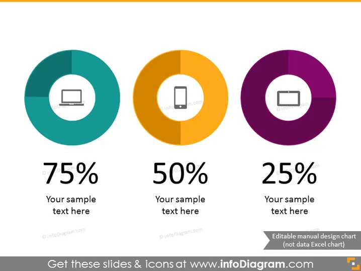
Les diapositives PowerPoint présentent trois graphiques en anneau, chacun représentant un pourcentage différent : 75 %, 50 % et 25 %. Chaque graphique est accompagné d'un espace réservé pour du texte, suggérant que les pourcentages se rapportent à différents sujets ou catégories qui peuvent être personnalisés. Le graphique à 75 % a une icône d'ordinateur portable, indiquant peut-être une statistique liée à la technologie. Le graphique à 50 % avec une icône de téléphone mobile peut représenter l'utilisation mobile ou la part de marché. Le graphique à 25 % avec un écran de projecteur pourrait se rapporter aux présentations ou à la part de contenu visuel.


